Monday, November 24, 2008

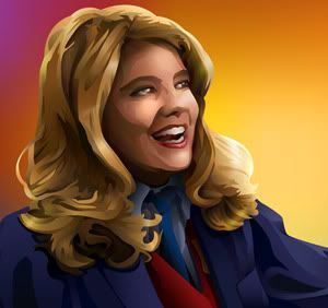
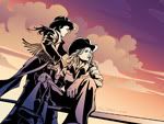
Cowgirls


widescreen: 1900x12001680x10501440x9001280x800
fullscreen: 1600x12001280x9601152x8641024x768

About this wallpaper
Roughly 90% Illustrator CS3 and 10% Photoshop CS3.

This is another Facts of Life wallpaper, but I did so poorly on making Blair look like Blair, and because the characters never dress in western wear, it really could be anyone. ;)

I came across some photos of Lisa Whelchel wearing a cowboy hat that made me go, 'ah, ha!' So this is a kind of what-if.

After I got my idea, I lightly sketched out the composition I wanted: Blair sitting on a fence or something and Jo standing behind her. My figure construction skills are seriously atrophied so I had a friend of mine pose for both figures, took photos of her, and used those as reference to get the perspective and everything right.

In Photoshop, I did the main sketch based on the photos I took, then had to do some head hunting for Jo and Blair's faces. Jo's was fine but it was hard finding an image of Blair with her head at the correct angle. The one I ended up using was of her feigning a pouty expression. No matter HOW hard I tried, I could NOT get my drawing to look like Blair without the pouty expression! I think Jo looks fine but... GRR. Now I know why comic artists who have to draw characters from live-action TV or film don't bother. ;)

Anyhoo - I took the sketch (which was nothing finished - literally just a quick 5 minute sketch) into Illustrator and dreweverything there, line work first. I was originally going to have something like forced-perspective telephone wires overhead but went with clouds instead.

I did this over the course of three days. The initial composition set-up took awhile, and tweaking the blonde's face probably took longer than anything else. While it still doesn't quite look like who I was going for, I am pleased with the overall results. :)

Friday, November 21, 2008

Facts of Life Jo wallpaper

Finally! A Jo wallpaper! Based on a screencap from xxsaosinxx (Thanks!)


widescreen: 1920x12001680x10501440x9001280x800
fullscreen: 1600x12001280x9601152x8641024x768

About This Wallpaper
Illustrator CS3, Intuos Wacom tablet, about 4 hours.
I'd had this idea for a Jo wallpaper for awhile, to theme it around her Blair-given "Mr Goodwrench" nickname-insult, in blues with mechanical stuffs happening. After the direction the previous Blair wall went in, I did this one in the same style (which, now that there IS a style, saved a LOT of time!). Stuck with the limited palette and masculine lines. Googled the Goodwrench logo and re-drew it in Illustrator (Live Trace did a lousy job) and found a nice motorcycle engine blueprint to Live Trace to vector and stick in the background. (I was originally going to use some of my Johnstone Supply catalogue illustrations instead since I feel like Live Trace is cheating but I really didn't feel like tracing my own engine. But they were more electrical oriented, not mechanical, so there you go).

I like this one a lot better than the Blair wall - I think it succeeds in its comparative simplicity - but then, as we know, Blair is superficially much more complex than Jo so I think it works. ;)

Sunday, November 16, 2008

Brilliant Blair: Facts of Life wallpaper


widescreen: 1920x12001680x10501440x9001280x800
fullscreen: 1600x12001280x9601152x8641024x768

About this wallpaper
This is the character Blair from the popular 1980s TV sitcom The Facts of Life", which I was very fond of as a kid.
Done in Adobe Illustrator CS3.
I lost count of the hours after the 50th time trying to work on it. Ugh. This is probably the 4th version of this wallpaper and I had started it the day after the last one I posted!

This thing was a pain in the butt. The theme was to be centered around Blair's quintessential "brilliant"; the original idea was to have a gigantic "BRILLIANT" in the background with Blair looking like she feels brilliant, with Jo glaring at her off to the side. ;) I did the whole thing with detailed shading and everything but Jo came out hiddeous. Also, I couldn't get the "BRILLIANT" worked in the way I wanted. I imported everything into Photoshop and tried stuff there to no avail. I ended up ditching everything and started from scratch in Illustrator, drawing it like you see now and then messing around with random shapes and fills, ditching Jo outright.

And yes, that's the VISA credit card logo, from the 80s. Whee. ;)

Here's what it used to look like:

No, I will not be working this into a wall any time soon so do not ask.
I swear I have a Jo one coming up next. Maybe I'll do it in the same style and they'll be a pair. :D

Tuesday, November 4, 2008

StarWars: Dark Leia

I don't generally do requests because I end up being really flaky about getting the piece done. But every once in awhile an idea really strikes my fancy and it not only jumps ahead in the "To Do" queue, it actually gets done!


widescreen: 1920x12001680x10501440x9001280x800
fullscreen: 1600x12001280x9601152x8641024x768800x600

About
It is based on an alternate universe for Star Wars, a "what if" deal: what if Leia led the Empire or something (I think this is based on Star Wars: Infinities - look at me, I don't know what I am drawing!). ;) I had the composition in mind well before I started. This is my first figure construction I have done from scratch in years - ugh, I should of hired my friend Ash or Hemisphere for it! Anyhoo, I made up my own costume based on the comic version and some other artist's version. Sketched in Photoshop CS3, drew everything/colored in Illustrator CS3, brought it all back into Photoshop to do shading and add textures. The stars and clouds are all my own textures. Took about 9 hours or so.

Monday, October 27, 2008

Cylon Centurion

At some point I had the idea to do a cylon centurion wallpaper, and then someone on Facebook requested a BSG wall as well so here I am, finally got to it. :D I would like to do one in a more WPA style which is what I had originally set out to do but got a bit carried away. Ah, well.


widescreen: 1920x12001680x10501440x9001280x800
fullscreen: 1600x12001280x9601152x8641024x768800x600

About…
Ah, pretty basic - I wanted to keep it simple. Drew the cylon and did the gradient background in Illustrator CS3, brought everything into Photoshop CS3 and added textures and the eye glow. One texture is a linen one by me, the other is rust by my friend Deborah Schildt. The eye glow is a brush I made. Took about 5 hours.

Friday, August 8, 2008

Tree for the Trees

4th challenge from the [info]art_wac community. Not too sure how I feel about this one. I am really liking these art challenges because I am not pressuring myself to make a masterpiece each time so I think of these as digital sketches / Illustrator experiments. :)


Widescreen: 1920x12001680x10501440x8001280x800
Fullscreen: 1600x12001280x9601152x8641024x768

Entire thing is vector, done in Illustrator CS3 with my Wacom tablet. Took about 3 and a half hours.

The concept was "trees or forest?". My concept started out with the two being one within the other within the other, etc. but it morphed into this singling out of the tree chart thingey in which I got to experiment with my sedimentary swatches I got from a government cartography website. :D The underground is a world without trees and I half-assedly stole the visual concept from Ben Schlitter, whose stuff I want to try re-creating for practice. The motherboard pattern is from an Apple II blueprint I found online.

Saturday, July 26, 2008

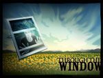
Through the Window


Widescreen: 1900x12001680x10501440x8001280x800
Fullscreen: 1600x12001280x9601152x8641024x768

This is for challenge #3 at [info]art_wac, "View From a Window". Illustrator & Photoshop CS3, took about 5 and a half hours. I wanted it to be completely vector but it wasn't coming out the way I had envisioned it so I brought all the vectors into Photoshop and messed around with it there. I am not very happy with it but it was a good exercise anyway. :)

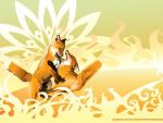
Sun Foxes


Widescreen: 1900x12001680x10501440x8001280x800
Fullscreen: 1600x12001280x9601152x8641024x768

This is in response to the [info]art_wac LiveJournal art community challenge "fun in the sun" that I missed the deadline for. The foxes were based on a photograph taken by my friend Jan DeNapoli (Muzzy Graphics.net). Everything else is mine, all mine. Illustrator CS3, took about 4 hours.

Friday, July 11, 2008

Self Portrait


Our first assignment over at the [info]art_wac was to do a self-portrait. I was gonna draw mine by hand but ended up not having time. Then earlier this week decided I needed a new banner and look for my LiveJournal. I have a picture of myself in my journal banner because, well, the journal is by and about me, so why not? So I combined the two projects into one.

Technical stuff: Made completely in Illustrator CS1 with a Wacom tablet. I took a photo of myself and traced it by hand in Illustrator. Uhh, that's pretty much it. ;)

Art Stuff: As a portrait, it is me, obviously. Green is one of my favorite colors (blue is the other but my journal was already blue, plus I look better in green ;) ). The wolf is my totem spirit and favorite animal. The trees represent Alaska and my connection to and love for the outdoors. The hill is a recycled graphic I made for an ARIA wall that failed - I love fields for the feel of running free that they represent. The swashes (bitbox.com) are pretty and almost tribal, the way I connect to society. The text is the name of my journal, and the Japanese 石山 から is my name "Ishiyama Kara", "Ishiyama" being my last name translated literally ('Stenberg' meaning 'stone mountain' in Swedish, 'Ishiyama' meaning roughly the same).

Sunday, June 29, 2008

I'd Know You Anywhere


Here's my latest and greatest Maria-Sama ga Miteru wallpaper ;) They are completely vector (except for the blur in the blue sky I had to do in Photoshop), done in Illustrator CS1, based on a promotional image for one of the Marimite OVAs (the 3rd one). The sky was originally for an ARIA wallpaper I was working on but decided was fail and the fun patterns/brushes in the orange one are from Bitbox.com. This took me about 5 hours - 2 for Sachiko & the panda, two for the backgrounds, and another for resizing them all (so much easier in PS but to preserve the colors I have to resize them manually in Illustrator).

(you can so tell I am making these on a Mac due to my designing to the left. Sorry Windows fans...)

Sky version:
Wide: 1920x12001680x10501440x8001280x800
Standard: 1600x12001280x9601152x8641024x768

Vector version:
Wide: 1920x12001680x10501440x9001280x800
Standard: 1600x12001280x9601152x8641024x768

Tuesday, June 17, 2008

Battery/Fuel panel session 5

Wow, two nice days in a row! I so hate painting in my room - it has horrible light, so every day that is sunny and not too windy I am outdoors working on this thing.

Normally I would do all the details last but there need to be sticks and grass in front of the chrome dash panel so I have to finish that before I continue on. Still more to do on it - there needs to be highlights around the "battery" and "fuel" letters, with shadows and highlights within the letters themselves, as well as river sludge and other green and rusting things. Still, fun. About 4 hours work today.

Thursday, June 12, 2008

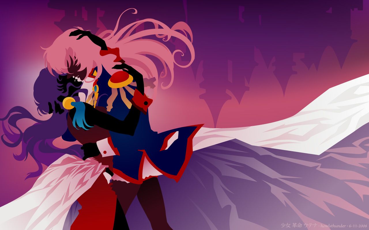
Revolutionary Girl Utena wallpaper

Done completely in Illustrator CS1. This is based on two different official Revolutionary Girl Utena cell art pieces that I liked, one from the anime series and the other from the film, so there are elements from the different costumes combined. This was a really free-form piece in that I had the idea to do the characters more in silhouette but ended up having fun trying out different color combos for everything (complimentary red & greens, reversing the characters' colors, etc) but here's how it ended up. I might do a silhouette version sometime.

Widescreen: 1920x12001680x10501280x800
Standard: 1600x12001280x9601152x8641024x768

Funny that I generally don't care for pinks at all but here I go making these fan art wallpapers that have pink palates. Go figure. ;)

Battery/Fuel progress, session 3

Been awhile since I last worked on this. Gotta be more prolific! I have no idea how accurate this photo is in terms of color, but it probably doesn't matter since the final won't look much like this at all, especially if you compare it to all the progress my Generator/Compressor painting went through.

Basically all I have done is continue to block and fill in areas with their next "main" layers of color. Worked on darkening the shadows and putting in a base for the moss. It is amazing how much green is actually in the original photo from all the river muck and things growing on the car. I am trying to keep it warmer than the photo and not so sludgy. Luckily I have a hard time painting in subdued colors ;) so we'll see where this takes me.

Wednesday, June 4, 2008

Doodle

Just a doodle. I had started from the center with no goal in mind, just to make fun shapes. Tacked on a tail, head, and mane at the end. I kind of like the direction the tail went; I may use it later for something.

Wednesday, March 12, 2008

Bleach art: how-to

I thought I would throw out a few pointers for those wanting to try their own bleach stencils.

Design
Choose something simple for your first stencil, something that cuts out in one piece so that you are only placing one piece of acetate down and not having to align little bits that get cut out separately. For instance, in my previous post, the heart on the Companion Cube had to be glued down separately. Also, little details are more difficult to keep from bleeding, so the more simple the design, the more likely your stencil will come out.

Materials
• a well ventilated area
• wear old clothes you don't mind ruining should you get bleach on them
• rubber gloves if you don't want bleach on your hands
• towels to cover your workspace and to protect areas of your shirt not blocked by the stencil

• chlorine bleach
• spray bottle - as fine of a mist as you can find
• X-acto knife (a utility knife or box cutter won't do it for details)
• spray adhesive
• lots of paper towels
• a hairdryer
• stencil material - I use acetate transparencies. You can get printable overhead projector sheets at Wal-Mart. I have also used Dura-Lar acetate, which is super heavy duty. Makes a more durable stencil but is a PAIN to cut out.

Process
1) Cut out your design. Careful not to over-cut corners because the stencil may tear at these points when removing it from your material

2) Lay out your item to be stenciled as flat as possible. It may be a good idea to insert a stiff, flat object to keep the item stretched flat (I used cutting boards) and to prevent the item from bleeding through to the other side in the case of shirts and the like.

3) Spray the back-side of your stencil with a light coat of adhesive and place your design. A little goes a REALLY long way so don't overdo it or you will have a hell of a time trying to remove your stencil from your shirt. Make sure to get any detailed areas as those are the most prone to bleeding.

4) block off any areas of your material that you don't want to get bleach on. If your design goes pretty close to the edge of your stencil, you may want to extend the border of your stencil with wide tape to prevent overspray.

5) Bleach away! Go one 'layer' at a time, don't saturate your material. Pat off excess bleach with towels/paper towels, especially on detailed areas, to prevent bleeding. The bleach will take a minute to fully "develop" so be patient - it is slower on materials such as denim or Carhartt so give it a little time. Blow dry your design between 'layers' so that the material doesn't become over saturated and bleed under the edges of your stencil. The more bleach you lay down, the lighter the design.

7) When you've got your design the way you want it, dry your design as best you can, then carefully remove your stencil. Tumble dry your material to beat out the crystalized bleach. Failing to do so and then washing your item can cause the bleach to re-activate and ruin your design.

* * * * * * * * * *
Those are the basics! Keep in mind that bleaching fabric also makes it weaker and prone to wearing out faster than the rest of your material. This method of decorating clothes is not good for items you want to last a long time, its more for raggy stuff you have lying around.

http://www.stencilrevolution.com/forum/viewtopic.php?p=354443
This is the link to the original article I read that got me to give this all a try. In the comments you will find a whole slew of ideas that other people came up with to help you get inspired. If you try it out, too, comment with a link to your design so I can see what you made. :D

Bleached Shirt Designs

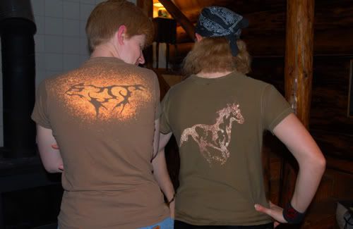
Last fall I saw an article on BoingBoing.net featuring a how-to for bleach stencil art on clothes. I immediately knew this was something I had to try. In October my friend Trey and I tried it out with a tribal wolf and horse I had designed. We had varying degrees of success testing some of the rules:

1) use 100% cotton ONLY. Poly blends will not work
2) use spray adhesive to keep your stencil flat on the shirt
3) do not oversaturate your material (causes bleeding)

Half the fun is watching the bleach "develop" the shirt, especially out of a black shirt since black ink often has some other color as a base, usually a rust or pinkish tan. We experimented with khaki, which can give anything from a greenish yellow to orange.

This past week, my friend Eric and I decided to make some shirts to honor our new favorite geekdom, Portal, in particular, the Weighted Companion Cube from the game (see above). This led to a few more fun designs, including the MYST spaceship (a 2-stencil design by Eric) and the Maria-Sama ga Miteru text logo and some character silhouettes.

Here's Trey and I modeling our wolf and horse designs. Each stencil (usually with more simple designs) can be used in both the positive and the negative. These were done with a globby, generic spray bottle and no adhesive on the stencils.

Here's the Companion Cube in all its glory on a black shirt. Its fun to bleach some areas a bit more than others in order to achieve a grungy, airbrushed look.


Here's Eric in his $8 Carhartt coat with MYST rocket ship. He did this stencil in two pieces, one for the body and one for the fins and nose. Carhartt takes more time to bleach than a thin shirt but the end result is worth the patience for sure. I gotta come up with something to put on my own Carhartt...


The Marimite logo. It says "Maria-Sama ga Miteru" which loosely means "Maria is watching Us" or "[the Virgin Mary] Watches Over Us". This was done on a slate blue longsleeve shirt.

My second Marimite shirt with the addition of a stencil of two characters running hand-in-hand along the bottom hem. The characters (Sei and Shimako) were made with the vector from the blue wallpaper in my previous post. I used two sheets of acetate taped together to get the width I needed to get the design to wrap around the side of the shirt so that one character was on the front while the other was on the back. What is amusing about this shirt is that while the fabric is navy blue, it bleached out a magenta color. I was kind of bummed at first but I think it makes a rather striking shirt. :)

Saturday, March 8, 2008

Marimite Wallpapers

Maria-Sama ga Miteru ("Marimite" for short) is a shoujo anime that was recently licensed in America (finally). It follows a group of girls on the student council at a Catholic girls school and is basically about their friendships and their character development. There's no action, no traumatic events - just minor high school drama with a lot of heart, no big plots, and tons of character development. ;) As a fan, I take the opportunity to practice my Adobe Illustrator skills by making wallpapers. Here are the three latest, all Marimite themed:

I had the image of this wall in my head when I woke up one morning - a wind-swept hill with clouds and people running along. Done in Illustrator CS1 with a bit of masking done on the rays in Photoshop CS1, the only thing I didn't create myself are the decorative swooshes in the sky, which were by Bittbox.com. I did the clouds twice, the first time with too much detail that left me unsatisfied, which is when I decided to try swooshes. I am particularly proud of the grass on this one.
Widescreen: 1920x12001680x1050
Fullscreen: 1600x12001280x9601024x768

Done completely in Illustrator CS3, 5 hours. This second wall I am the most happy with as it has the best sense of mood and most interesting composition. I generally start out a wallpaper with a color in mind and this was originally to be sunset orange with a silhouetted tree-covered hill. Immediately the sunset went pink & yellow and I didn't ever get to the silhouetted hill once I found a good reference picture that had hills instead. I had major color space issues on this wallpaper so what you see is not quite what I had originally created - yet one more reason I am a print person, not a web person. ;) Long story short, working on a Mac, and not in the right RGB space (sRGB IEC61966-2.1).
Widescreen: 1920x12001680x10501280x800
Fullscreen: 1600x12001280x9601152x8641024x768

Done completely in Illustrator CS3, 7 hours. Again, I started out with a color (green), which to me means plants. While all the walls were experimental, the first two were a bit more "safe" in that they are set in a wide-open landscape where this one is cloistered in the woods. It is much easier to place things compositionally against a wide open sky than it is to build a particular setting so this piece was a bit tricky and I feel loses its sense of mood. At any rate, it was a great chance to try getting the opening in the leaf canopy created and to try out creating rays of light. At first the grass was dark and in the foreground but when I took it away everything looked better. In the end I put it back in and pushed it back because, as a friend pointed out, it reminds us of the layered nature of a forest setting.
Widescreen: 1920x12001680x10501280x800
Fullscreen: 1600x12001280x9601152x8641024x768

I think I will do more, perhaps in other fandoms as well. The fun thing about keeping them entirely vector is that they are infinitely re-sizeable for print, unlike most of my previous walls which were built at 72ppi. I also really enjoy the practice in Illustrator- it has always been my favorite program but it is more technically challenging to learn. I never learned how to use gradient meshes in college or any of the other fancy stuff Illustrator can do so I am trying to push the limits on what I DO know how to do and I am discovering little bits as I go along. :)