Saturday, December 29, 2007

It's Callisto!


This was my Christmas present to my friend Trey, one of the world's biggest Callisto fans. (For the un-initiated, Callisto was one of the better-known villans from the TV series Xena: Warrior Princess). This is from a scene in the episode "Ten Little Warlords" where Callisto is dragged down into Tartarus after a battle with Xena. I chose to draw this scene because of the dramatic lighting, Callisto's expression, the challenge of all the hands, and because it told a story rather than just being a character posing.

Same materials as last time - 11"x14" 100lb paper, sketched in graphite, inked with Sharpie marker. I had a lot of fun using Sharpies - because they bleed into the paper a lot I had to keep my lines and shapes more blocky. I experimented with letting the eye complete forms rather than drawing them in - this is more obvious in Callisto's left hand (her left, to our right) where it becomes lost in her hair. Took three times longer to do than the previous Xena drawing. I re-drew the hands a zillion times, re-drew her entire body once, and the details took patience and precision to fill in. I also spend a lot of time staring at the screenshot printout to decide what should go black and what should stay white. Fun!

Digitally shaded in Photoshop CS1 using my trusty & crusty ol' Wacom Intuos 1 tablet. I spent more time shading this piece than I did Xena, particularly in my use of hard-edged brushes on the leather to give it a more textured look. The background rock texture is an un-inspired photo of asphalt I took a few summers ago - I didn't spend any time fancying it up.

I'm enjoying my time diving into my Xena nostalgia and look forward to drawing more characters from the show. Keep an eye out on this blog for more. ;)

Saturday, December 8, 2007

It's Xena! Shaded!


Here she is again, this time shaded (Photoshop CS1). Normally you'd use gradients for a proper comic-book look but I was being lazy and just used the airbrush. For me, the final version is the plain ink one, this was just a distraction but I thought I'd share it anyway. ;)

Monday, December 3, 2007

It's Xena!


I got into an inking mood as well as a Xena mood. I took the opportunity of being away from my computer all weekend to draw what you see here. It was quite eventful, as anything pertaining to Xena should be.

I started this piece with an ink illustration in mind but by the time I got done with the sketch I liked it so much I decided to trace a copy of what I'd done into my sketchbook so I could do a pencil piece as well. Being pitch black at 11pm and without a light box didn't stop me; I set up a halogen light outside the house to shine in through a window so I could trace on that. In setting this up, I gave myself a (very) minor concussion which (literally) stopped me in my tracks. I was able to continue and finish two days later. ;)

She's about 11"x14" on 110lb paper, inked with Sharpie permanent markers (I couldn't find my Micron pens).
Below is the pencil sketch I was so desperatley trying to preserve with my head-damaging skills.

Saturday, December 1, 2007

Nenana Ice Classic Poster


The Nenana Ice Classic that takes place each year in Alaska. This wooden tripod is assembled and put on the ice of the frozen Tanana River in the town of Nenana. The tripod is rigged to a timer and they have a lottery to see who can guess the time at which the ice goes out - at which point the tripod will topple over, stopping the timer.

This was my entry for a poster contest they advertised in the paper. Full-size it is 18"x24". Any age or medium, the only requirements being the dimensions, the text (as seen here), and that the tripod be on it. This took me about 9 hours to do, in Adobe Illustrator and Photoshop.

The whole thing is original with only slight borrowing of the idea of the clouds from an actual 1930's WPA poster for Yosemite. I did nearly everything in Illustrator; the bridge and tripod were both done with simple paths that I then converted to shapes and distorted and hand-manipulated to give them perspective. Once I got everything the way I wanted it, I copied each element one-by-one into Photoshop as shapes so I could manipulate them individually. Each element got its own folder Group in the Layers palette where I then shaded them to my liking and applied a nice texture I made one day at work. The tripod was originally quite cartoony and it took awhile to get it to be simple without looking cheezy. Being a near-silhouette helps achieve a better look, I think. The text is Kabel (top; an authentic 1930's font) and SignPainter (bottom). I left some room at the bottom for the competition folks to add further text, as it looks like they usually have more info on there.

I'm pretty pleased with how it all turned out. It's tough being really simplistic with shapes without making it all look cartoony. I think everything flows well; I originally sketched it with the tripod and the bridge but no clouds - those came later after I researched WPA posters and saw the Yosemite poster that had them. The clouds really give it a lot of energy and helps pull your eyes back up the 'canvas'.

*Note: I attempted to calibrate my monitor before I did this; the color/brightness may be WAY off at the moment. I'm going to take the file to my office and adjust it on my computer there; if the change is severe, I'll update this post.

** This isn't the final version - This hasn't been color corrected and I changed "2008" to be small and to the right under the main heading.

P.S. - I didn't win! ;)

Saturday, August 25, 2007

Dragonfly


Here are two wallpapers I made of a dragonfly I found on the sidewalk:
Widescreen 1680x1080
Fullscreen 1280x960


I'm working on cleaning up the scan for a left-side of the dragonfly. That way if someone has two monitors side-by-side they get both halves of the dragonfly.

I'd like to do something artistic with this sometime - either in Photoshop or as a painting. The wings are so beautiful - they remind me of the Musée D'Orsay in Paris with its enormous glass and iron canopy - the beauty of humanity's industrial works reflected from nature.

Tuesday, August 21, 2007

WPA-Style Denali Poster

Each summer the MSCVB puts out a series of 4 black and white ads, each covering a different aspect of the Mat-Su Borough (glacier hikes, fishing, canoeing/boating, RVing, etc). This year we changed it up a bit by making the ads look like WPA posters from the 1930's, featuring illustrations by me. :D

We've since carried the WPA flavor over to the 2008 Mat-Su Visitor Guide. The guide breaks the Mat-Su Borough into 5 regions and each region gets its own WPA-style postage stamp. The above image is actually for the "Off the Beaten Path" region, which is everything in the borough that is not road-accessible, but I thought the sky was a good place for text and so dressed it up as a Denali poster just for fun.

The background is closely based on an actual WPA poster for Montana or something - the mountains came pre-resembling Denali so I borrowed their design, though drew it from scratch and did my own color theme. The Cessna 180 is from a photo I took - the colors are totally changed (the original plane was white with brown).

I'll have to upload those ads and the other stamps sometime.

Wednesday, August 8, 2007

Anteater Wallet


I simply adore Engrish.com! My sister and I were wondering to ourselves if it would be possible to create our own Engrish, seeing as how we have a firm grasp of the English language and really, it takes a feeble and carefree grasp of English in order to produce quality Engrish. So we did this MadLibs style: Kaisa randomly picked an animal while I picked a promotional paragraph on some product I had in my room. She picked an anteater and I had picked hand warmers. Next, I had Kais (who didn't know what my product was) give me a noun here or adjective there and took out most of the words in the sentences. And I made a wallpaper out of it.

So no, this is not authentic Engrish! but it is authentic Kara art. The anteater is mine, all mine! The kanji says "wallet" and "giant anteater", à la Wikipedia. Background texture in the wallpaper is mine as well.

Friday, July 20, 2007

Bumble Bee


Sometimes art kind of makes itself.
I found this bumble bee on the floor at work and had the thought of scanning her at the highest resolution possible with our Epson V700. The image is enormous and the detail fabulous. The sheet of paper I put over her kind of makes this nice fuzzy blue backdrop - kind of feels peaceful. I think with the way the bee's head is tucked makes her look sad or shy and tired. Or possibly just dead, but hey. ;) It might be kind of fun to do a quick painting of this sometime.

Saturday, June 23, 2007

Knik Car: Battery/Fuel

This is a photograph of what I am currently painting. With work getting busy it's been awhile since I've worked on it but I thought I'd share the progress anyway - that's the point of this blog, right? :) Anyway, it's the driver side dash board of one of the cars the military put into the Knik River bank to help stop/slow bank erosion over by the hatchery. There's quite a lot of interesting stuff over there besides cars: stoves, refrigerators, barrels, old tin cans with still-readable labels... Some of the cars were in the bank and some weren't doing much as far as erosion prevention and were just sitting along the river, making for scenic abandoned photography. I plan to paint some of those, as they're probably more appealing to folks, but I liked the dash on this car and thought I could play up the contrast in the blue distant background/chrome and the orange rust.


Left: The canvas with the final sketch on it before I start blocking everything in.

Right: is the first phase of blocking. Currently it has more shadows and some of the birch trees semi-blocked into the blue distant background but this is pretty close. Color-wise, the painting won't really resemble the photograph, which is pretty common for me as I tend to paint pretty saturatedly, which I like. For instance, the Generator/Compressor original photograph was really washed out, the rust was more purple-looking, and the overal image was cold. I'm no photographer - when I take photos I'm more concerned about composition, subject, and angle of light, in that order. Everything else I can make up.

This piece will be a challenge. I had to teach myself how to do rust on the Generator/Compressor and hopefully I've retained something from that but I've not done moss before - and I don't want to do it in the 'easy' Bob Ross style. I will be playing down the moss and concentrating on bringing out the chrome in good contrast - it's all about the dashboard, "Battery/Fuel" (yay for slash names!) :)

Generator/Compressor: Original


I found the original photo of the Generator/Compressor! You can see how washed out it is and not very orange. I had done some Photoshop tutorial practice using the image that darkened the background elements and was inspired to do the painting that way to bring out the foreground elements. Below is the final painting for comparison:


On my monitor at home the painting looks a bit green but at work it looks okay. I hate the inability to achieve true color across the board with monitors and the internet. Grr.

Friday, June 1, 2007

Generator/Compressor


click to view larger image

24" x 18" oil on canvas, 2006

Close up of large black pressure gauge
Close up of large white water cooler gauge

This is my most recent finished oil painting, completed in 2006. I estimate the time it took to be two to two-and-a-half weeks but I can't be sure since I started the painting in 2005 and went for months in between painting sessions. I do know that the large white gauge took 6 hours to complete.

The subject is an air compressor/generator used for powering mining drill bits that I found up above Independence Mine in Hatcher Pass, just outside of my hometown of Palmer, Alaska. I'll have to post photos of the entire thing sometime - it's built into its own trailer and is clear up a mountain side, left to die and rust. Abandoned things are my favorite subject matter because of their unknown history. They invite the viewer to imagine who first owned it, who left it there, is anyone still alive who ever knew the object, was it working when it was abandoned? Some day there may be no humans alive who know what the item was really all about, how it worked, how it behaved, any quirks it might of had. Catalogue descriptions will of faded and the item itself may be rusted to bits and all we'll have left are any possible photographs (or paintings!) that folks like me thought to take along the way.

Here are some in-progress photos I took for posterity:
1) Canvas drawing
2) Blocking
3) Shadows added
4) More details

Kennicott


click to view larger

18" x 24" oil on canvas, 2004/5

This is my second to last most recent (as of this post) oil painting, of some buildings at Kennicott, Alaska that were part of the Kennecott (yes, different spelling) copper mining operation there. I painted this from a photograph I took in the 90's sometime. The composition isn't so great and I knew it from the start but I wanted to paint it anyway, a) just because I wanted to paint and b) because of all the different elements and details it would be good practice.

Again, I painted this over the course of a year, starting in Portland, OR and finishing in Alaska, but it probably took 2 weeks to complete.

The Last Kiss

20" x 30" oil on canvas
February 2002


This is my best known painting to date and is the first painting I did on my own after I got out of highschool. It's a copy of a production shot from the last episode of Xena: Warrior Princess that you see around the web. I printed out the shot at nearly the same size as the canvas (tiled out of QuarkXPress) and painted from that. It took about a week (compressed) to do. The scan doesn't do it any justice; the colors are much richer in the actual painting.

Again, as a disclaimer: I painted this for fun for myself in honor of a show that meant a lot to me as I went through some tough self-realisation in life. The original image does not belong to me and I'm not making a dime from this painting.

Wednesday, May 30, 2007

Sketchbook


pen, 2007

Here are two pen sketches I did this spring from random photos I found online. The mom & cub sketch was from a National Geographic Society magazine. As a disclaimer, these were drawn soley for practice and I'm not making a penny from them - they aren't mine.

I made a 1920px widescreen desktop wallpaper of the wolf mom & cub image using my own brushes and textures in Photoshop here. I'll have to create and upload different screen sizes later.

Tuesday, May 29, 2007

Teryl Rothery

digital illustration
Adobe Illustrator & Photoshop
September 9, 2006

Hallalundi said she'd kick my ass if I didn't participate in the 2006 Teryl Rothery contest, a fan art/fan fic contest put on by Terylicious.net. So, not wanting my ass to be kicked, I participated. Which was good because I hadn't done a digital illustration in over a year.

Teryl photo from http://terylicious.net/. Other photo textures from myself and Deborah Schildt

I did it for print, so the original (not online) is 300dpi at 20" wide. I made it in widescreen monitor dimensions so it would be easy to downsize for wallpapers. For the curious, this was done in Adobe Illustrator and Photoshop CS and took about 9 hours to complete. I drew all the shapes in Illustrator, then imported the paths to Photoshop where I colored them each individually, airbrushed/blended areas, and added details (hair, shine) and textures. The only filter used was Gaussian Blur on the background. I'll put together a quick visual walkthrough in PDF format sometime later today.

Wallpapers
1024x768
1152x864
1680x1050 (widescreen)

Monday, March 12, 2007

Soccer Ball


12" x 7", oils on canvas, 2005

As part of a self-challenge, on my LiveJournal I asked friends to give me photos that I might try to draw or paint. My friend Hope Preston gave me an image of a soccer ball that I painted in half a day, non-stop. It's about 12" by 7", oils. It was done sometime in the fall of 2005.

Disclaimer: the original image is not mine - I did this painting for fun and practice and did not make a penny on it.

Monday, March 5, 2007

Tipping the Velvet


digital illustrations
Adobe Illustrator & Photoshop
May 20th & May ?, 2005

These are both from the BBC film Tipping the Velvet, based on screenshots I took from the DVD. Drawn in Adobe Illustrator CS and colored in Adobe Photoshop CS. Not much else to say about them other than to disclaim that the originals are not mine and do not belong to me - I created these for fun, for love of the film, and for practice and I did not make a penny from any of it.

Saturday, February 24, 2007

Wonder Woman

10" x 14"?, ink, Feb. 2006

I was supposed to send my friend InstantAmazon a doodle, and couldn't think of anything, so I asked for a topic and she said people. On my last day of house sitting I came across this Wonder Woman comic in Spanish -- the title and issue number are written on the image there for refrence. So this is drawn from an image out of that comic. The only thing I did different was where the lasso begins and ends, making it a bit more dynamic visually, and her face, mostly her mouth, is different since I really can't draw those retro late-70's early 80's big lips they used to do - at least, I've never had practice. ;)

Here's a link to the original English issue of Wonder Woman which includes a picture of the original that I was drawing from (scroll down): http://www.amazonarchives.com/ww232.htm

Also, here is a 1260px widescreen wallpaper version I created:


Again, not mine - drawn for fun and practice and I didn't make a dime.

Monday, February 12, 2007

Quick Portraits


I did a challenge on my LiveJournal where I asked my friends to give me photos of themselves and I would have an hour to draw each person. I went over time on all but the last one of Eric (the pencil line one), which I did in 34 minutes.

Wednesday, January 24, 2007

Eclipse


9' x 2' ink-on-canvas, 2000?


from my LiveJournal, 18th-Jan-2004:
This is a 2 foot by 9 foot triptych I did as an experimental final project for Advanced Drawing in college at the end of 2000, I believe. In that class we had to choose an art style we'd like to experiment with and study, and I chose the neo-art neuveau look of Terry Moore (Strangers in Paradise). This project wasn't done to mimick his style, but was an experiment in a more comic-looking linework using an experimental medium some classmates of mine in highschool stumbled upon. I actually did this in 16 and a half hours the night before it was due. It was fun but taxing - it's flipping HUGE. I had to paint all three canvases at the same time to ensure even color throughout .... anyway, it was quite the endeavor.

After hanging on a hall wall at the college for half a year, I finally lugged it home and then up to Alaska where it is living behind my mom's couch (we have no walls long enough for it). Being so large I only have these low-quality digital photos of the painting.

It's called "Eclipse". It had a lot of meaning when I did it, but I don't really remember most of it now. I do remember balancing it so it specifically goes from complex to simplistic, from left to right. I like the last panel the best and the first panel the least.

Monday, January 15, 2007

Ink Wolf


24" x 36" ink on canvas, December 1999

This was based on a dream I had, which I won't go into, but it's about survival of the spirit. Totally out of my head. This painting is a huge reason of why I am so hesitant to let go of any of my work. I sent it to the person who was in the dream as a gift and she's since moved to a different country, the painting left behind with her mother whom has since moved. I pray the painting didn't get thrown out as I put a lot of work (12 hours) and heart into it. My only copy is a Xerox made of 4 sheets of 11x17 (B) that I scanned and stitched together in Photoshop.

Wednesday, January 10, 2007

What I have been up to

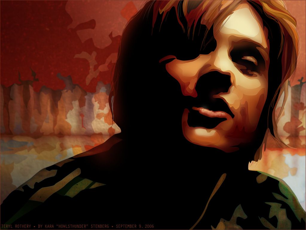
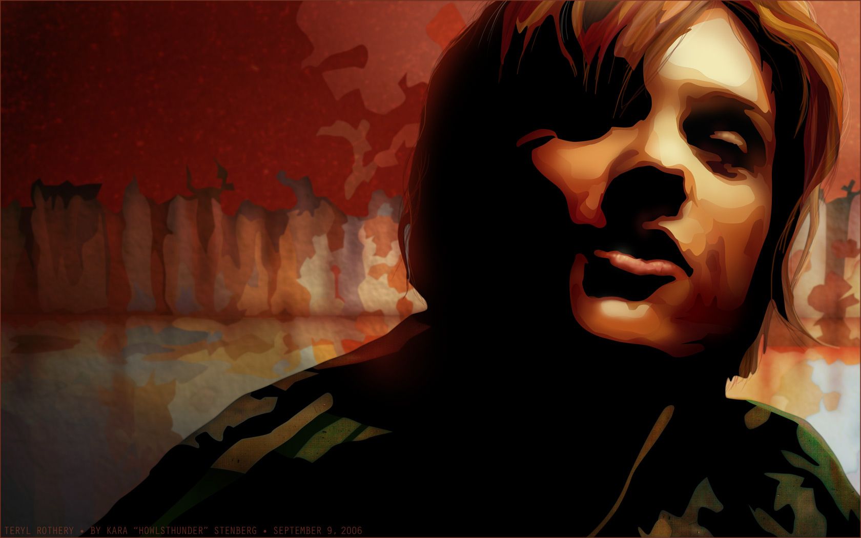
For folks who stumble upon this and haven't seen me since college or highschool, here's a bit of an update:

The fall after highschool graduation I started college in the Graphic Design program at the Art Institute of Portland, then a very tiny place consisting of two buildings and maybe 300 students. While Art Institutes have their drawbacks, the small community meant I got a lot of one-on-one time and the entire process was very personable for me. I took (and even helped create) every illustration and fine-art type class they had and graduated with a bachelors of science in graphic design (with honors, woo).

After college, I got an at-home job digitally illustrating a variety of items for the Johnstone Supply parts catalogue. It was seasonal and the faster my turnaround, the more work I got. Because I was their only digital illustrator, my work was cleaner and I could turn around illustrations faster so I became their lead illustrator. I drew an insane amount of electric motors, switches, odd plumbing items, and all manner of things. It was fun and I really got to hone my Adobe Illustrator skills.

Unfortunately, after two summers of that, JS decided to switch to photography so I packed up and moved back home to Alaska

Moving home was hard but turned out to be the best thing, career wise. In the 'states they tell you that you must specialise - you cannot do both graphic design and illustrate. I knew better about Alaska and I was right. I've done a little bit of both since I've been back and in 2005 I got a job working for Whittington-Evans Communications (WEC) (Chris). Chris also does double-duty as an architect and we share office space with his work partner, Gary, who is an architect. We're combining businesses at the moment and it's fun. I get to do most of the graphic design work with Chris acting as an art director, not just for the graphic design side of things but I get to do graphics for architecture as well.

Currently...
So WEC is where I currently work. We do everything from business identity to brochures, ads to posters, pamphlets to entire magazine-sized documents, including the Mat-Su Visitor Guide, which I must say is one of the better looking guides in the state. ;) At WEC I've been able to impliment every graphic design trick taught to me at the Art Institute as well as all of my Illustrator tricks taught to me by the fantastic Lisa Johnston/Kelson.

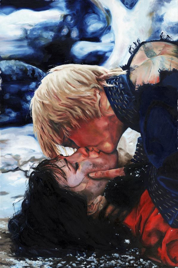
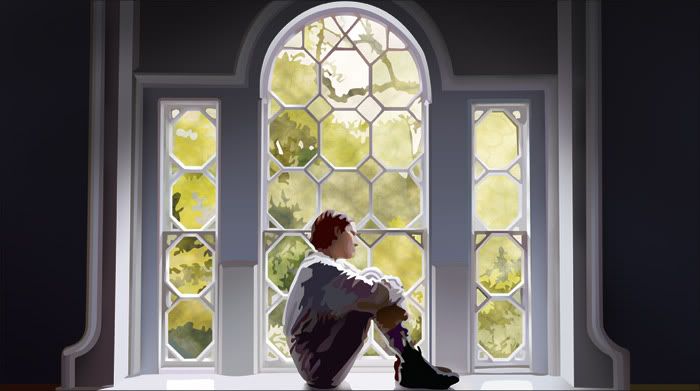
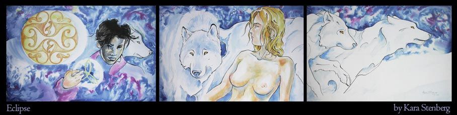
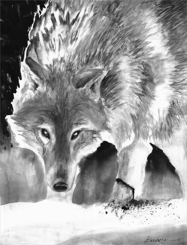
Sadly, my fine arts have fallen by the wayside. Though I took every opportunity to create paintings while I was in college, life took some crazy turns that did not include much in the way of art. Since highschool I have completed a total of three oil paintings on my own that were not school related. The good news is that they are far and beyond any other paintings I have ever created and I have to say I'm rather happy with myself. Due to some recent life stresses and haunting dreams, I've begun pushing myself to paint.

I've always had a passion for abandoned old things, places like abandoned mines and burnt out buildings, things like old train cars and vehicles used to halt erosion along river banks. Odd things found in the middle of nowhere with little clue as to how they came to be there. A lot of these things are self evident as to how they got to be where they are and why they were abandoned but there are plenty of things people are starting to forget about. In just a generation or two, no one will recall anything about these abandoned items. I think it's facinating to wonder about what these things were like when they were new and when was the last time anyone cared for it?

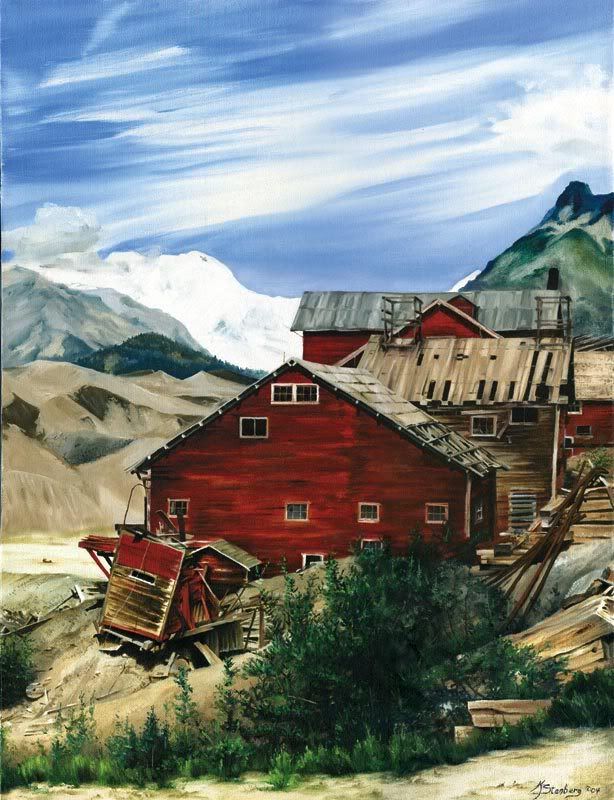
It began with an ill-composed painting of some of the 
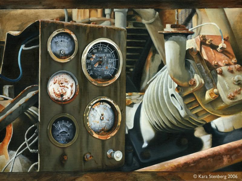
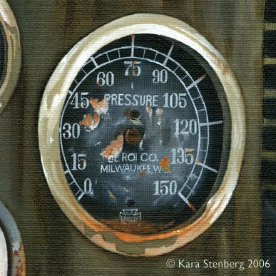
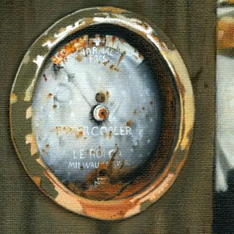
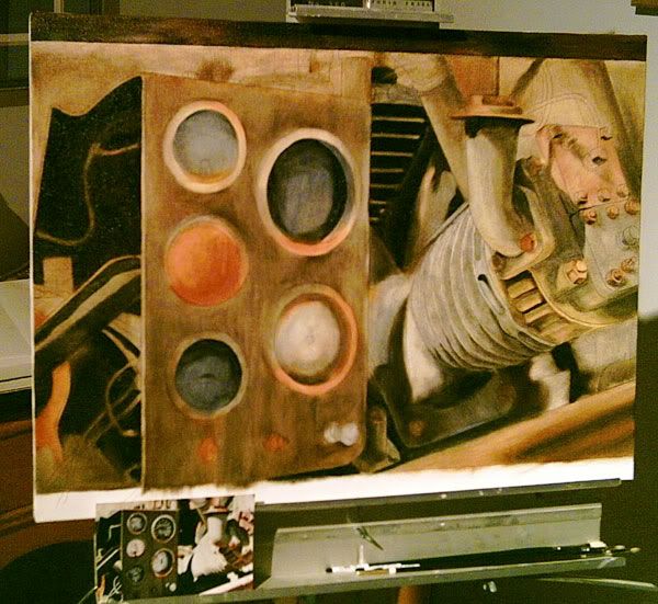
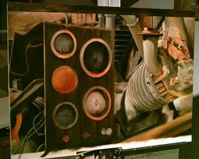
Kennecott mill buildings in Kennicott, Alaska. Piles of wrecked boards and twisted rails with mostly standing buildings. Fun. The second I call "Generator/Compressor" - it's an abandoned air compressor used to drive drill bits for mining in ore. It was left halfway up a mountain in 
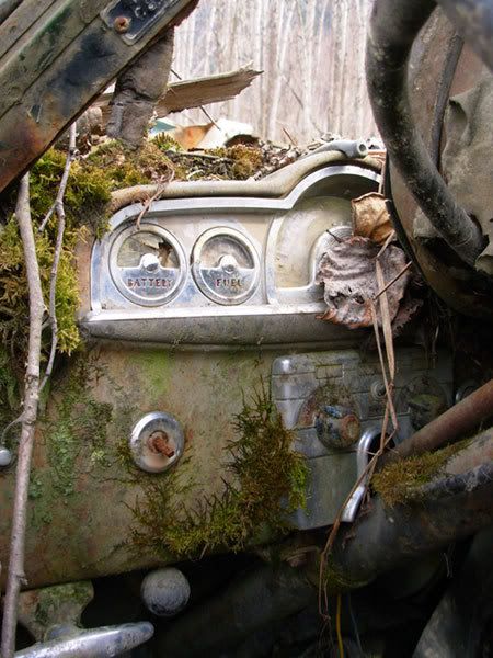
Hatcher Pass - I did a painting of the control panel and nearby parts. I'm currently working on a painting of the dashboard of an abandoned car that was one of dozens used to stop the Knik river from eating away at a local fishing stream. Next I may do more of the abandoned cars, all from the 50's and back, and then one of Independence Mine. Or rather, the board pile that is left. A woman in charge of the tourism element of Kennecott expressed interest in my Kennecott painting so I'd like to do more of those as well.

Right now I don't have time to do a whole lot of paintings, nor do I have the room or facilities for it. I'd like to get enough together to do an "Abandonings" show, and then expand into site-specific series, one for Hatcher Pass/Independence Mine and one for Kennecott, as those would have good commercial value as well as just being fun and interesting to do.

And that's about the size of it.

Thursday, January 4, 2007

Welcome to my art blog

I've decided to create this blog as a way of keeping friends and family updated as to my progress with art. I generally post most things in my LiveJournal but not everyone has an LJ, so here we are.

Howlsthunder Art will only be used for my art: old art, new art, things in progress, ideas, sketches, digital art, and fine art. I'll post practice things as well as original pieces. I'm not very prolific so I'll try to throw in some 'blasts from the past' to keep things moving and we'll see how it goes!

This post was backdated, originally written in May - I moved it back in order to scatter posts apart to shorten by-month archive view-times.