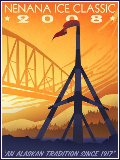
The Nenana Ice Classic that takes place each year in Alaska. This wooden tripod is assembled and put on the ice of the frozen Tanana River in the town of Nenana. The tripod is rigged to a timer and they have a lottery to see who can guess the time at which the ice goes out - at which point the tripod will topple over, stopping the timer.
This was my entry for a poster contest they advertised in the paper. Full-size it is 18"x24". Any age or medium, the only requirements being the dimensions, the text (as seen here), and that the tripod be on it. This took me about 9 hours to do, in Adobe Illustrator and Photoshop.
The whole thing is original with only slight borrowing of the idea of the clouds from an actual 1930's WPA poster for Yosemite. I did nearly everything in Illustrator; the bridge and tripod were both done with simple paths that I then converted to shapes and distorted and hand-manipulated to give them perspective. Once I got everything the way I wanted it, I copied each element one-by-one into Photoshop as shapes so I could manipulate them individually. Each element got its own folder Group in the Layers palette where I then shaded them to my liking and applied a nice texture I made one day at work. The tripod was originally quite cartoony and it took awhile to get it to be simple without looking cheezy. Being a near-silhouette helps achieve a better look, I think. The text is Kabel (top; an authentic 1930's font) and SignPainter (bottom). I left some room at the bottom for the competition folks to add further text, as it looks like they usually have more info on there.
I'm pretty pleased with how it all turned out. It's tough being really simplistic with shapes without making it all look cartoony. I think everything flows well; I originally sketched it with the tripod and the bridge but no clouds - those came later after I researched WPA posters and saw the Yosemite poster that had them. The clouds really give it a lot of energy and helps pull your eyes back up the 'canvas'.
*Note: I attempted to calibrate my monitor before I did this; the color/brightness may be WAY off at the moment. I'm going to take the file to my office and adjust it on my computer there; if the change is severe, I'll update this post.
** This isn't the final version - This hasn't been color corrected and I changed "2008" to be small and to the right under the main heading.
P.S. - I didn't win! ;)
No comments:
Post a Comment