Saturday, December 10, 2011
Painter's Thinner acquired!
I was honored this week to have my painting, "Painter's Thinner", chosen for purchase by the Palmer Museum of History and Art at their annual art acquisition! I am such a shy hermit I have no idea how others see my art. I paint what I do because *I* like it, and because it represents the place where I live and the memories of my colorful childhood. So the fact that a panel of fellow Valley people picked my painting means a great deal. Thank you! :)
Wednesday, October 26, 2011
Laser cutter
At work I have access to a 12"x24" laser cutter. I have been tasked with coming up with new business cards for the company that could possibly utilize the laser - which means I finally get to learn to use the darn thing. :) It will plot out of Adobe Illustrator, if only the ancient PC that runs the thing (parallel or SCSI only, grr) doesn't have Illustrator. Which means I have to carefully organize my art in Illustrator for exporting to AutoCAD, which I have absolutely no training in.
Anyway, on my last go-round with the cards I tossed in one of my vector illustrations (as seen here) to get an idea of what I might be able to do with my own art:
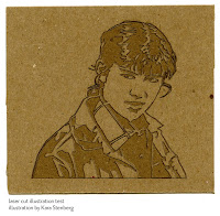
I still have a lot to learn. On this sample the outline was etched out but the shapes weren't etched out on the first pass for some reason. Then when I ran it again with the shapes to be etched out, everything was misaligned. *shrugs* You'll have that.
Thursday, June 9, 2011
Atlas Imperial Diesel Engine Co.
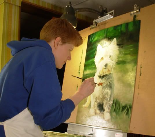
What a mouthful! Two months later I have finally finished my three Atlas Imperial Diesel Engine Co. (AIDEC) paintings, part of my abandoned mining series. I have several more of the engine that I would like to paint in the future but I have plans to do one of the mill buildings at Independence Mine in Hatcher Pass, Alaska first - the mine that was once home to the AIDEC engine.
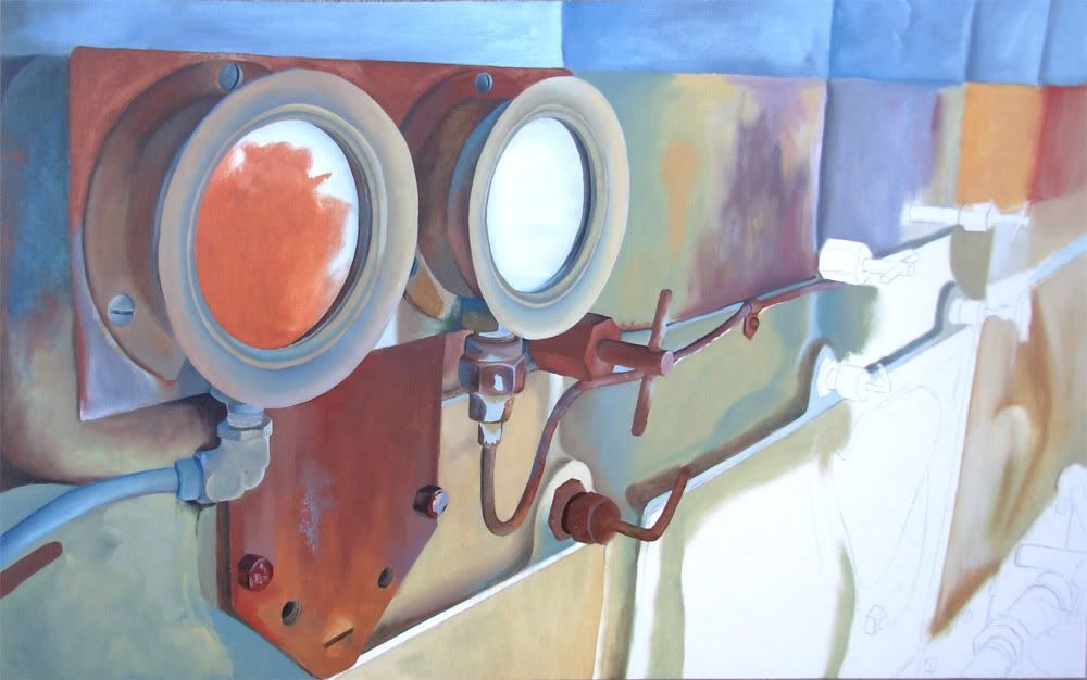
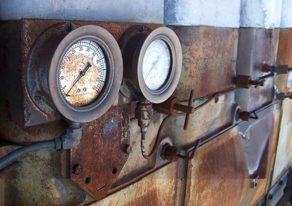
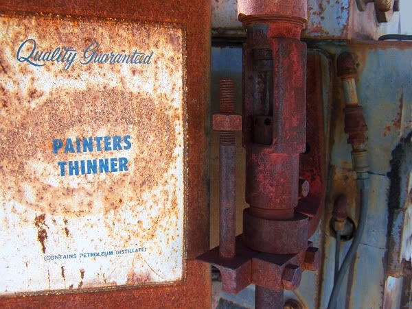
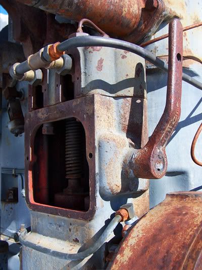
I've spoken before about the importance of documenting our historical buildings, especially since the wooden structures decay so quickly. Machinery kind of takes a back seat in terms of visual appeal but these were the objects miners dealt with on a daily basis. Without these machines, hard rock mining would not of been worth the effort for many of the gold miners. And though metal takes longer to wear down in the elements, these machines are changing yearly as well. "Atlas Gauges", for instance, has since lost the needle on the glass-less gauge. The title tin can of "Painters Thinner" has also since gone missing. Be it weather or vandals, bit by bit the mining equipment of the gold rush era is fading just as surely as the buildings around them.
Below are the three paintings, though I don't have a photo of "Lever Face" finished - I had to get it framed in time for a show that it is currently in and failed to remember to photograph it for my blog first. Only the lower right hand rusted area isn't finished in the pic here.
Click to see each image larger.
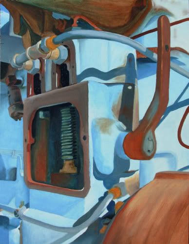
"Atlas Gauges" 26"x16"

"Lever Face" 18" x 24"

"Painters Thinner" 24" x 18"

Oil paint on illustration board
May/June 2010
Edit to add: Updated the image for "Lever Face" so it now shows the final painting, all done. :)
I've spoken before about the importance of documenting our historical buildings, especially since the wooden structures decay so quickly. Machinery kind of takes a back seat in terms of visual appeal but these were the objects miners dealt with on a daily basis. Without these machines, hard rock mining would not of been worth the effort for many of the gold miners. And though metal takes longer to wear down in the elements, these machines are changing yearly as well. "Atlas Gauges", for instance, has since lost the needle on the glass-less gauge. The title tin can of "Painters Thinner" has also since gone missing. Be it weather or vandals, bit by bit the mining equipment of the gold rush era is fading just as surely as the buildings around them.
Below are the three paintings, though I don't have a photo of "Lever Face" finished - I had to get it framed in time for a show that it is currently in and failed to remember to photograph it for my blog first. Only the lower right hand rusted area isn't finished in the pic here.
Click to see each image larger.
"Atlas Gauges" 26"x16"

"Lever Face" 18" x 24"

"Painters Thinner" 24" x 18"

Oil paint on illustration board
May/June 2010
Edit to add: Updated the image for "Lever Face" so it now shows the final painting, all done. :)
Friday, May 6, 2011
Faces In My Palette
 I use disposable paper palettes for my oil painting and though I look at them before I toss them out, I have never had cause to keep any of them before. I was transferring my wet, useable paint from an old sheet to a new one when I saw a face in one of the leftover paint stains! It only needed one more eye and a little shading to add emphasis but it was otherwise there - a green Hobbes-like cat face! Fun! So I checked out all the other stains and found this sheet had several.
What is odd is that I've looked over all my sheets closely for faces since then but none of them have such obvious characters living within. Hmm.
Click to see larger
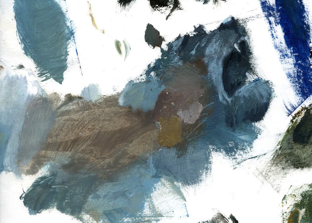
Oils on palette paper, 2011.
Tuesday, May 3, 2011
The Abandoned - blocking
Oils on illustration board, blocking stage.
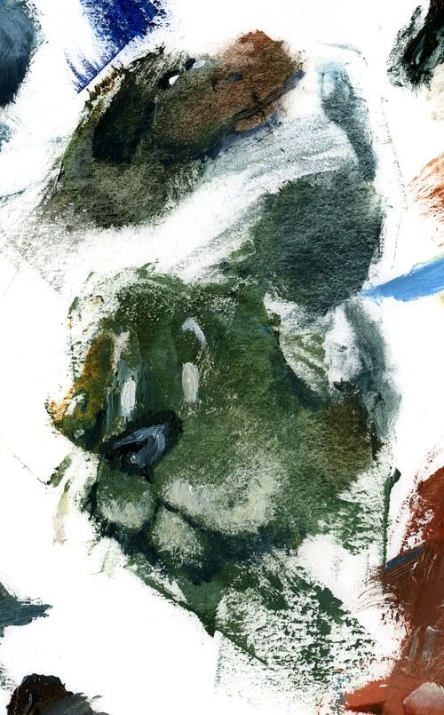
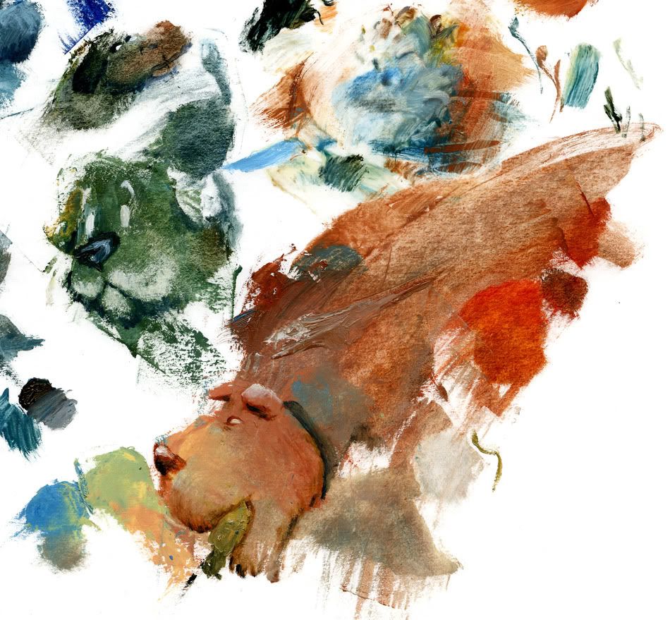
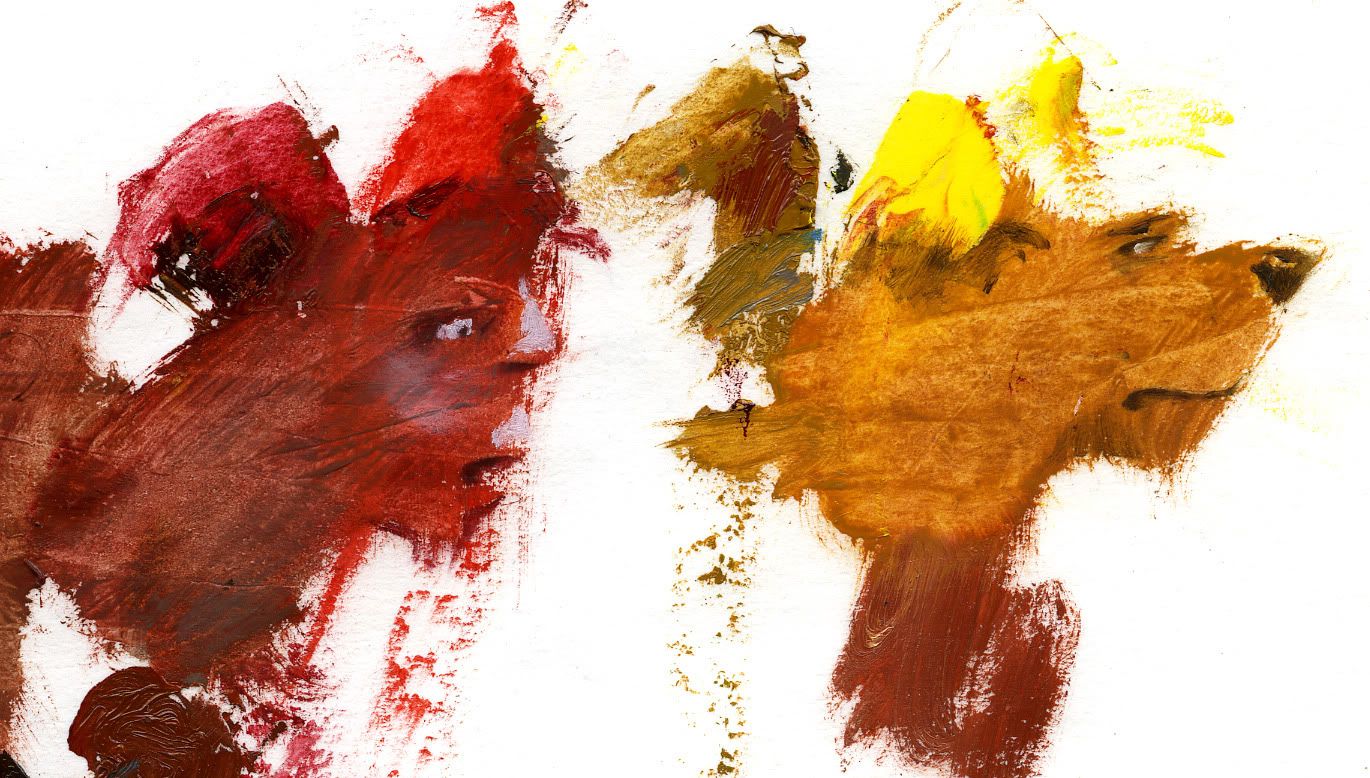
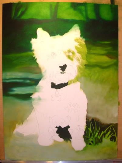
So I thought I'd block in all three pieces at the same time so they'd be more unified in their color palettes. It's pretty much working though it has taken one weekend apiece to block each one in. Normally I sketch on my canvas in Sharpie so that I can then quickly stain the canvas and not lose my lines. But since I've switched to illustration board, the paint soaks in past the Sharpie, leaving the ink lines on the surface. This means I need a lot more paint to cover up the lines. While this could be used to good effect, its not the look I was going for so this time I sketched in pencil. But I forgot how badly pencil smears and I didn't want to lose my lines. Being the detail control freak that I can be, I skipped the staining phase and went for a more tedious route in blocking. *headeasel*
I have nicknames for them: Lever Face, Painters Thinner, and Atlas Gauges, appearing below in that order. It is also the order I blocked them in. Right now I am really liking Lever Face; I think it is interesting and has good contrast. Painters Thinner will require more subtle lighting to make it work. Atlas Gauges is based on my favorite photo of the batch and it is interesting for me to find and draw out the colors that were hidden in the photograph.
Atlas Gauges isn't fully blocked in because the paint I had leftover wasn't what I needed for the large areas. The colors ARE what I need for some of the detailed areas so I started doing some of the details ahead of myself. We'll see if that gets me into trouble down the line.
Click to see them larger.
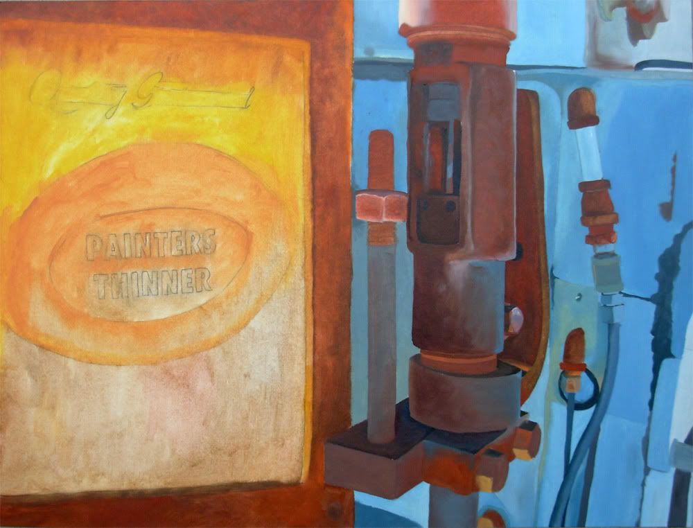
When painting rust or flaking paint, I block in the color that is physically underneath. So for the rusted dial or the can of painter's thinner, that would be the rust color. Later I'll scrape over it with a palette knife loaded with white paint to put the flaking paint "back on" there.
So I thought I'd block in all three pieces at the same time so they'd be more unified in their color palettes. It's pretty much working though it has taken one weekend apiece to block each one in. Normally I sketch on my canvas in Sharpie so that I can then quickly stain the canvas and not lose my lines. But since I've switched to illustration board, the paint soaks in past the Sharpie, leaving the ink lines on the surface. This means I need a lot more paint to cover up the lines. While this could be used to good effect, its not the look I was going for so this time I sketched in pencil. But I forgot how badly pencil smears and I didn't want to lose my lines. Being the detail control freak that I can be, I skipped the staining phase and went for a more tedious route in blocking. *headeasel*
I have nicknames for them: Lever Face, Painters Thinner, and Atlas Gauges, appearing below in that order. It is also the order I blocked them in. Right now I am really liking Lever Face; I think it is interesting and has good contrast. Painters Thinner will require more subtle lighting to make it work. Atlas Gauges is based on my favorite photo of the batch and it is interesting for me to find and draw out the colors that were hidden in the photograph.
Atlas Gauges isn't fully blocked in because the paint I had leftover wasn't what I needed for the large areas. The colors ARE what I need for some of the detailed areas so I started doing some of the details ahead of myself. We'll see if that gets me into trouble down the line.
Click to see them larger.
When painting rust or flaking paint, I block in the color that is physically underneath. So for the rusted dial or the can of painter's thinner, that would be the rust color. Later I'll scrape over it with a palette knife loaded with white paint to put the flaking paint "back on" there.
Tuesday, April 5, 2011
Airline Doodles
I had a nice 5 hour flight (each way) on which to kill time. I did so by doodling! The words in the backgrounds are mostly lyrics from songs I was listening to at the time and were a good way to fill in the negative space during turbulence. Done with a Sharpie Pen (not a marker, the Pen).
This first one is primarily made up of images sketched from the Alaska Airlines magazine, though the Pacific Northwest Coast art is from my head. The lyrics are from "Coloured Bedspread" by Annie Lennox.

The second one is all mostly stuff from my head except for the woodpecker and the man in the lower left corner which were from the Alaska Airlines magazine. It contains a bunch of random words as well as lyrics from "Weekend" and "Holiday" by The Birthday Massacre and "Ice Queen" by Within Temptation.
This first one is primarily made up of images sketched from the Alaska Airlines magazine, though the Pacific Northwest Coast art is from my head. The lyrics are from "Coloured Bedspread" by Annie Lennox.
The second one is all mostly stuff from my head except for the woodpecker and the man in the lower left corner which were from the Alaska Airlines magazine. It contains a bunch of random words as well as lyrics from "Weekend" and "Holiday" by The Birthday Massacre and "Ice Queen" by Within Temptation.
Monday, March 14, 2011
Up next: Abandoned series begins
I've recently been motivated to get started on my abandoned mine series, with focus on machinery at the moment. These are the three reference photos (that I took) that I will be painting from simultaneously. I only have 2 months to do these in and thought if I chose images with a similar palette I could finish them faster if I painted them at the same time. We'll see…
These are all from the Independence Mine area of Hatcher Pass.
These are all from the Independence Mine area of Hatcher Pass.
Monday, February 28, 2011
Current Studio
Because people ask… I am currently living in the basement at my grandma's house. I've converted her old sewing area into an art area. A lot of the stuff on the shelves is my grandma's and some of my sister's art stuff, too. But this is how I have it set up for painting at the moment. Had to get creative with all mom's grow lights I kept from the move since the basement has stark fluorescent lighting. ;)
I usually like to print out my reference photo to paint from but I don't have a working printer at home, the color isn't always that great, and its sometimes a waste of paper so I usually just have the image on my laptop and paint from there. I can zoom in and rotate the image as needed and even check color and draw guide lines to match my canvas.
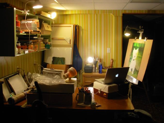
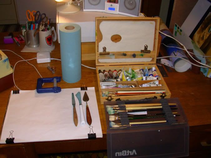
Oil painting stuff! Just the things I use as I am painting - I've got a tackle box full of other tubes of paint and more random brushes are living in a brush bag on the shelf. I'm a very frugal painter - this is the same wooden art box I've had since I was in middle school, although I've got all-new brushes and some new paint. (The laser pointer is for my cat - he gets bored watching me sometimes).
There I is!
I usually like to print out my reference photo to paint from but I don't have a working printer at home, the color isn't always that great, and its sometimes a waste of paper so I usually just have the image on my laptop and paint from there. I can zoom in and rotate the image as needed and even check color and draw guide lines to match my canvas.
Oil painting stuff! Just the things I use as I am painting - I've got a tackle box full of other tubes of paint and more random brushes are living in a brush bag on the shelf. I'm a very frugal painter - this is the same wooden art box I've had since I was in middle school, although I've got all-new brushes and some new paint. (The laser pointer is for my cat - he gets bored watching me sometimes).
There I is!
Alice
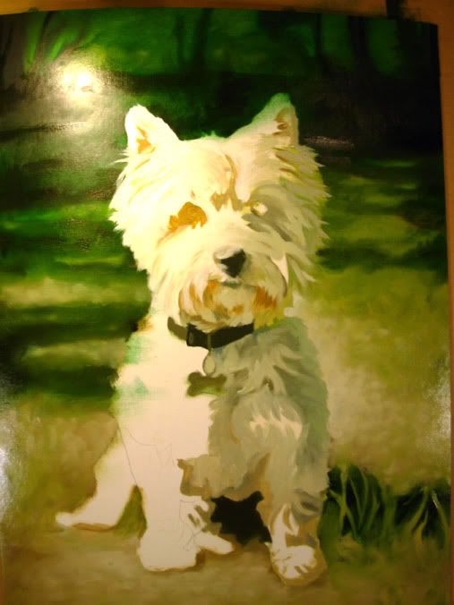
Not quite done but pretty close. Oil painting commission. Don't remember the dimensions off the top of my head. 11 hours, I think.
Here it is blocked in (did this last spring)…
The rest of this I did last night. Went over the background to give it texture, impressionist-style but blended. Starting to fill in Alice now…
And here's where I ended up!
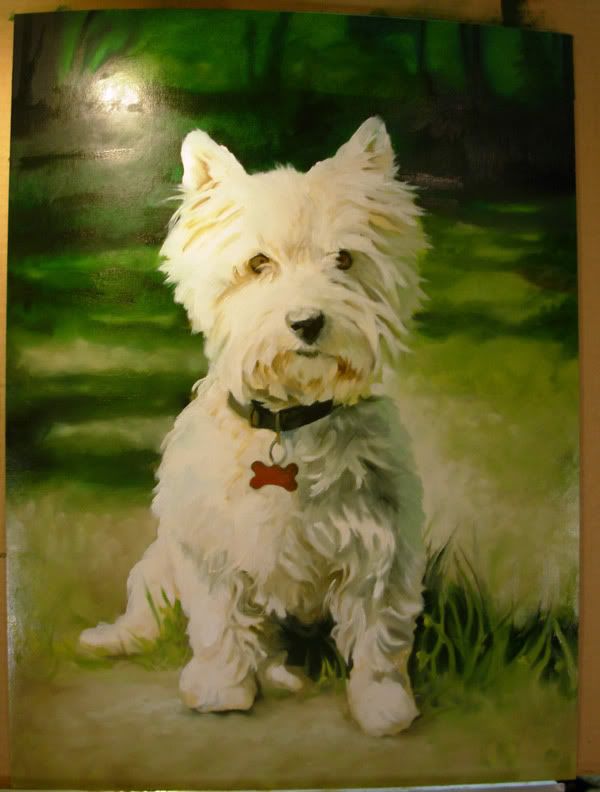
Sorry about the glare - it's the best I could do with the lighting I had in the basement. It's kind of got a yellow tint look in the pics. When I'm done and it is dry I'll scan it in and post the finished piece.
Here it is blocked in (did this last spring)…
The rest of this I did last night. Went over the background to give it texture, impressionist-style but blended. Starting to fill in Alice now…
And here's where I ended up!
Sorry about the glare - it's the best I could do with the lighting I had in the basement. It's kind of got a yellow tint look in the pics. When I'm done and it is dry I'll scan it in and post the finished piece.
Friday, February 4, 2011
Stargate Resurrected

A lot of digital artists of my generation practice their skillz on making fan art. For me it's the ready-made inspiration so I can concentrate on practicing my software techniques.
Back when Stargate: SG-1 was on the air (and hadn't jumped the shark) I made a lot of wallpaper fanart, mostly in the grunge style. I wasn't particularly good at it (hey, it was practice) but I came up with some interesting compositions. A few months ago I was going down memory lane, looking at some of them and this one caught my eye. It was a lot cleaner than my older walls and I thought it would make a great vector piece. The old one had a foreground image of Carter laying on the floor and I thought it distracted from the cool background image that I wanted to concentrate on.
To translate for non-Stargate fans, this was from an episode called "Entity" where a digital-based lifeform from another world downloaded itself into Stargate Command's computer system and eventually ended up downloading itself into Carter's brain, taking over her mind and body. The image of Carter is when the entity left her body, creating arcs of electricity that lit everything in blue light. The syntax in the background was seen on all the monitors in the complex.
About 90% of this was built in Illustrator CS4 (Carter, the background color, all the text) and then I brought each element into Photoshop to add some blurring to the text. It was fun putting all the text into perspective. For the most part, the text is as-seen in the screen-shot I took from that episode, though in a few places it was too blurry to make out so I made stuff up.
All Widescreen, no fullscreen, sorry.
1920x1200
1680x1050
1440x900
1280x800
Thursday, February 3, 2011
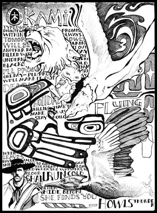
The Kitsune/Okami Division
Normally I only share visual art here but I thought I'd mix it up a bit and add a song.
I have been playing guitar for 17 years or so, albeit self-taught. I primarily play acoustic finger-style though I do have an electric (and am in the process of building another, which will make an appearance on this blog). I have made up quite a few songs, all instrumental.
This is a draft of a song I made up as part of a healing process. A few transitions have since been changed, other bits shortened, and some complexity has been added in the picking but its largely the same. I record things in GarageBand on my Mac with a cheap external mic, so the sound quality isn't top notch - ends up sounding more indie lo-fi but you get the idea. This song is 3-part guitar; I plan on building a baritone guitar after the one I'm building now and plan on re-recording the song with that later. ;)
I recorded this back in November but I've been offline for the past two months which is why I'm only now getting around to this.
Here's the direct download link:
https://files.me.com/howlsthunder/6jj05t.mp3 - 6:50min, 128kbps, 6.3MB
Subscribe to:
Posts (Atom)