I currently work for Whittington-Evans Communications. Its a great place to work because my boss has, over time, increasingly used my illustration skills more and more to replace photography in the ads and other pieces we do for the
Mat-Su Convention & Visitor Bureau (MSCVB), one of our more ad-prolific clients. It all started when Chris noted that one of my digital illustration styles feels kind of
WPA, a style both he and I like. It tied in with this postal/travel style we were developing for the MSCVB one year and it took off from there and I've had a lot of fun working with this style. Because this style features my illustration work I thought I should share it with you here.


We originally began this style in black and white newspaper ads. Because we were working with newsprint, the designs had to be very simple, much more basic than my usual style. Later I had to adapt all of the illustrations into color. For the most part they converted well but there were a few that required added detail or a change in shading scheme. I did a TON of research, primarily by digging through the Library of Congress' web collection
here. It also took some doing to find some WPA-esque fonts in our collection here at work. Our results aren't strictly true to the WPA genre but I think they have enough retro flair to make them eye-catching compared to what you see for ads around the rest of Alaska.
These ads here are just some of my favorites. The RV "Hit the Road" ad was the very first one I did back in 2007. The fishing and glacier ads were also from that year while the "Trail Mix" ad was actually much more recent and was originally color - you can see the evolution in detail as well. In earlier illustrations I tried to keep the people very basic. In actual WPA art a lot of human figures were very stylized since the posters they were going on were done with silkscreen. We also took a different direction with the typography in newer ads, as evidenced on the "Trail Mix" ad.
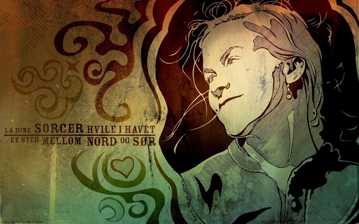
Working in this style influenced my own art I do for fun and I've since tried simplifying the shapes I draw in Illustrator for a "less is more" look. This is highlighted by
this poster I did for a contest.


