Saturday, December 29, 2007

It's Callisto!


This was my Christmas present to my friend Trey, one of the world's biggest Callisto fans. (For the un-initiated, Callisto was one of the better-known villans from the TV series Xena: Warrior Princess). This is from a scene in the episode "Ten Little Warlords" where Callisto is dragged down into Tartarus after a battle with Xena. I chose to draw this scene because of the dramatic lighting, Callisto's expression, the challenge of all the hands, and because it told a story rather than just being a character posing.

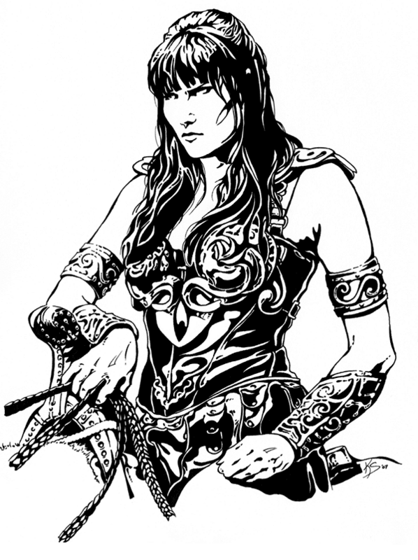
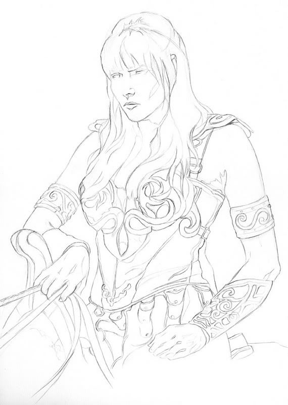
Same materials as last time - 11"x14" 100lb paper, sketched in graphite, inked with Sharpie marker. I had a lot of fun using Sharpies - because they bleed into the paper a lot I had to keep my lines and shapes more blocky. I experimented with letting the eye complete forms rather than drawing them in - this is more obvious in Callisto's left hand (her left, to our right) where it becomes lost in her hair. Took three times longer to do than the previous Xena drawing. I re-drew the hands a zillion times, re-drew her entire body once, and the details took patience and precision to fill in. I also spend a lot of time staring at the screenshot printout to decide what should go black and what should stay white. Fun!

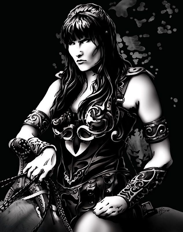
Digitally shaded in Photoshop CS1 using my trusty & crusty ol' Wacom Intuos 1 tablet. I spent more time shading this piece than I did Xena, particularly in my use of hard-edged brushes on the leather to give it a more textured look. The background rock texture is an un-inspired photo of asphalt I took a few summers ago - I didn't spend any time fancying it up.

I'm enjoying my time diving into my Xena nostalgia and look forward to drawing more characters from the show. Keep an eye out on this blog for more. ;)

Saturday, December 8, 2007

It's Xena! Shaded!


Here she is again, this time shaded (Photoshop CS1). Normally you'd use gradients for a proper comic-book look but I was being lazy and just used the airbrush. For me, the final version is the plain ink one, this was just a distraction but I thought I'd share it anyway. ;)

Monday, December 3, 2007

It's Xena!


I got into an inking mood as well as a Xena mood. I took the opportunity of being away from my computer all weekend to draw what you see here. It was quite eventful, as anything pertaining to Xena should be.

I started this piece with an ink illustration in mind but by the time I got done with the sketch I liked it so much I decided to trace a copy of what I'd done into my sketchbook so I could do a pencil piece as well. Being pitch black at 11pm and without a light box didn't stop me; I set up a halogen light outside the house to shine in through a window so I could trace on that. In setting this up, I gave myself a (very) minor concussion which (literally) stopped me in my tracks. I was able to continue and finish two days later. ;)

She's about 11"x14" on 110lb paper, inked with Sharpie permanent markers (I couldn't find my Micron pens).
Below is the pencil sketch I was so desperatley trying to preserve with my head-damaging skills.

Saturday, December 1, 2007

Nenana Ice Classic Poster


The Nenana Ice Classic that takes place each year in Alaska. This wooden tripod is assembled and put on the ice of the frozen Tanana River in the town of Nenana. The tripod is rigged to a timer and they have a lottery to see who can guess the time at which the ice goes out - at which point the tripod will topple over, stopping the timer.

This was my entry for a poster contest they advertised in the paper. Full-size it is 18"x24". Any age or medium, the only requirements being the dimensions, the text (as seen here), and that the tripod be on it. This took me about 9 hours to do, in Adobe Illustrator and Photoshop.

The whole thing is original with only slight borrowing of the idea of the clouds from an actual 1930's WPA poster for Yosemite. I did nearly everything in Illustrator; the bridge and tripod were both done with simple paths that I then converted to shapes and distorted and hand-manipulated to give them perspective. Once I got everything the way I wanted it, I copied each element one-by-one into Photoshop as shapes so I could manipulate them individually. Each element got its own folder Group in the Layers palette where I then shaded them to my liking and applied a nice texture I made one day at work. The tripod was originally quite cartoony and it took awhile to get it to be simple without looking cheezy. Being a near-silhouette helps achieve a better look, I think. The text is Kabel (top; an authentic 1930's font) and SignPainter (bottom). I left some room at the bottom for the competition folks to add further text, as it looks like they usually have more info on there.

I'm pretty pleased with how it all turned out. It's tough being really simplistic with shapes without making it all look cartoony. I think everything flows well; I originally sketched it with the tripod and the bridge but no clouds - those came later after I researched WPA posters and saw the Yosemite poster that had them. The clouds really give it a lot of energy and helps pull your eyes back up the 'canvas'.

*Note: I attempted to calibrate my monitor before I did this; the color/brightness may be WAY off at the moment. I'm going to take the file to my office and adjust it on my computer there; if the change is severe, I'll update this post.

** This isn't the final version - This hasn't been color corrected and I changed "2008" to be small and to the right under the main heading.

P.S. - I didn't win! ;)