Friday, December 25, 2009

Cessna 180 N2294C

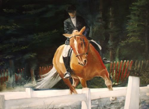
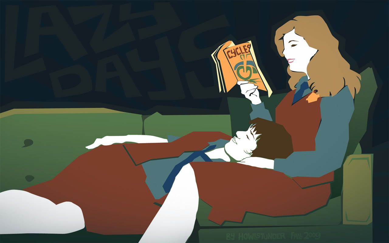
Oil on illustration board, 40" x 20", 3 days

I did this for my dad for his Christmas present. I really don't know how long it took to do but it happened over the course of 5 days, but I didn't work entire days. Anyhow, I painted it from a photo of my dad and his airplane, a Cessna 180. I think the photo was taken at the Kustatan River on the western side of Cook Inlet here in Alaska. My dad no longer has the airplane but it was a big part of all our lives. My dad got his pilot's license only a month after he got his drivers license and went to college to be a professional pilot, though that is not what he ended up doing. He got this airplane before I was born and my sister and I pretty much grew up in that airplane. We would at least fly once a month if not once a week until I went to college. I miss flying and I miss that plane terribly. I think my dad is content with his boat now but hopefully he'll like this painting. :)

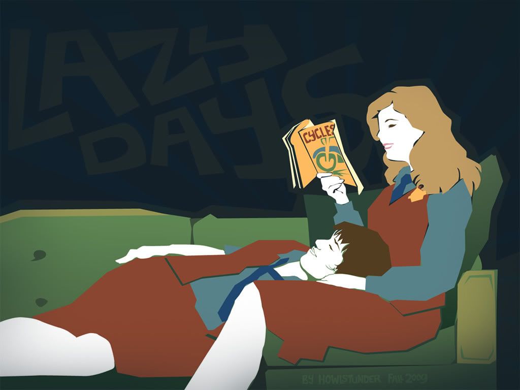
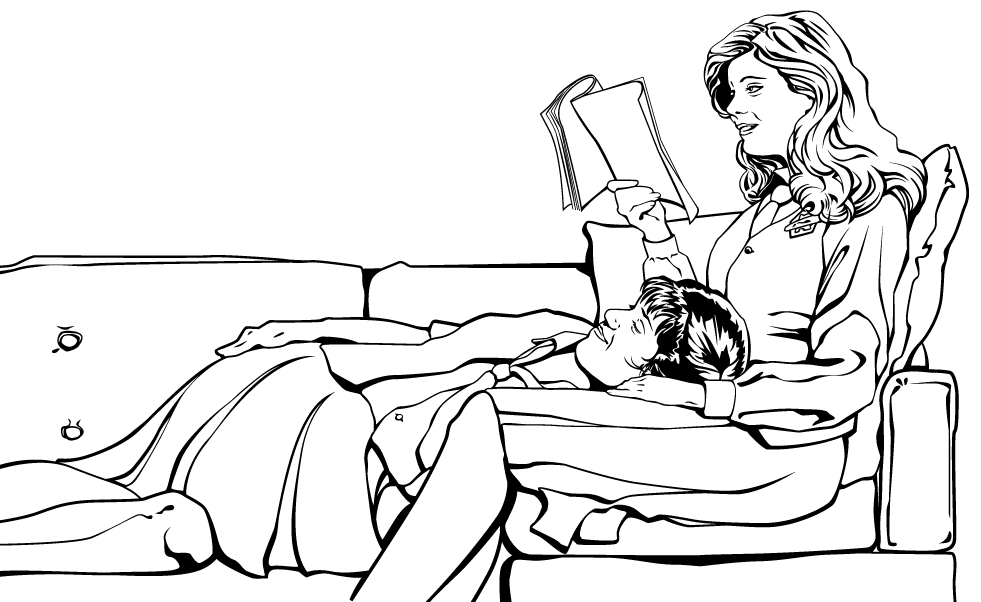
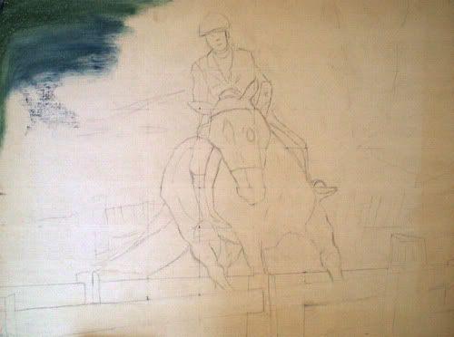
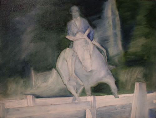
Below are some in-progress photos. All of these are a bit warped because the illustration board is a bit curled. Ah well. There are 4 pictures, one for each day, basically, not counting the final piece (click on the above thumbnail to see the final piece larger).


Penciled in. That took several hours. O_O;


Blocked in. Normally I'd stain the entire canvas but time was not on my side - see, one nasty thing about illustration board is that it sucks up the paint so it takes a LOT more paint (and more time) to block in the piece.


Plane underside shaded and clouds done.


Airplane and other items colored in and grass added (I hate it).
After this step the only things that were added were the plane numbers, the corrugation on the tail flap, highlights on the white bits of plane, Pop's fishing pole, and my signature - things that couldn't be done with so much wet stuff going on previously.

~==~

Overall it looks pretty sharp I think. Its an awesome photo of the plane anyway and I am pretty pleased with the saturated colors and the clean lines I managed with the plane (as in, how crisply I painted the whole plane, not just the stripes on it, though I gotta say those were a pain. Steady-handed surgeons watch out!) I hate painting grass and rather like it all impressionistic and I think maybe the whole piece could be more successful if everything but the plane and Pop were blurry but your eye doesn't really ever settle in the grass so I don't think it matters. It's a gift, not a gallery piece and a good chance to try things out and learn.

Damien

Oil on canvas, 12" x 16"
I didn't keep proper track of time on this one since I split the time across two days but it took longer than Shadow. I'd guess maybe 10 hours. (the dark shadow across the top is from my easel, sorry).

My second Christmas present painting is done! This one is of my Aunt PeterAnn's old dog Damien who was very dear to her. Damien died when I was 2 or 3 but I have faint memories of her. Because I was so young, I couldn't say her name properly so it always came out "Dame-er". I referred to her as Damer for years and always thought it strange when my Aunt referred to her by her actual name and to this day I default to "Damer". ;)

The photo this was painted from was poorly composed as far as light goes; Damien's eyes weren't lit at all, for one, so I had to play a few things up a bit. What's kinda funny is that the photo this is from lives on the same page as the reference photo for Shadow. Its kind of fun that I happened to paint two photos from the same page of the same album of two dogs in the same house when we all lived at my grandparents. :)

It was harder to find a line between detail and generalizations with my brush strokes, which is why this one took longer, since Damien HAD more detail to paint. I think the halo effect semi-sorta kinda worked. It was harder to know where the blues in her fur lived and I think I could of gotten her chest shaded a bit darker but it works. I painted it under harsh kitchen lighting so it looks fantastic under more dim, usual lighting. Though I think Shadow is way more successful as an art piece, I think my aunt will like Damer just fine. ^_^

And I happened to take a photo of this painting after I got it blocked in so you can see what it looked like at the midpoint:


One final note of trivia; both the Damer and Shadow paintings are recycled! They use canvases that were part of this stupid 7-canvas painting I started in highschool but never finished. Another fun thing that binds the two art pieces (the others are: same paint, same dimensions, same photo album, same location, same time period). :D

Monday, December 14, 2009

Shadow


Oil on canvas, 16"x12", 7 hours


Okay, here's the final painting. This is for my mom for Christmas. Its based on a photo of the first dog we had when I was growing up, some kind of shepherd named Shadow. She was about 6 years older than me and lived to be 14 or so. I'd done a pretty good watercolor of this when I was a kid but it was part of a portfolio I'd used to skip a bunch of basic art classes in school and the school system lost the portfolio. I've always been pretty bummed at the loss of that watercolor but it was also my mom's favorite. When I was looking through photo albums to come up with ideas for paintings for Christmas this year, I came across the original photo of Shadow and *bing* the proverbial lightbulb went off in my head and here we are. :)

Here's a detail of the eyes:

Saturday, November 14, 2009

Space Experiment


Widescreen only:
1920x12001680x10501440x9001280x800

About:
Created in Photoshop CS4 in 6 or 7 hours.

This was for an art challenge on LiveJournal, the criteria being "space". I wasn't going to be literal about it; I was going to do something about the emotional space between people. Then I thought it might be fun to make a star field to put in the background - I'd only made one previously and had always wanted to do another. When I got going on the star field, however, I kind of got carried away and so the final piece ended up being a literal outerspace thing. Its not fantastic, as far as digital spaceworks go but it was good practice. I really envy the people who can do photo-realistic space art - especially nebulas; I'd love to learn to make one!

So, all done in Photoshop, took about 6 or 7 hours.
Thank you to some of the nifty tutorials found at SolarVoyager, including the two Greg Martin tuts I'd used previously (the man is THE master at creating spacefields - check out his illustrations at his site).

Wednesday, November 11, 2009

Lazy Days

Some time ago I asked for wallpaper idea suggestions and this is from one of those. It is a blatant rip off of "Just a Couple of Girls" by Harry Wilson Watrous.


wide: 1920x12001680x10501440x9001280x800
full: 1600x12001280x9601152x8641024x768

About: The painting gave me poses but I drew everything from scratch myself. I actually drew this out in the "pen & ink" style of my last several wallpapers and then purposely drew sloppy blocks of color under the "ink" to fill it in and when I took the linework away, this is what was left. I liked the retro look of it and decided to leave it that way. :D You can see the ink by itself here. Their expressions were bugging me anyway so I like the end version much better.

Wednesday, October 28, 2009

Lanee wallpaper

When I drew this I knew I was going to want to make a vector version of it and make a wallpaper. I was originally going to do it all in Illustrator but I saw this fantastic wallpaper on Pixelgirl Presents and so it went in a different direction. Kind of experimental.


wide: 1920x12001680x10501440x9001280x800
full: 1600x12001280x9601152x8641024x768

Technical: Illustration by me, based on a photo I took. LiveTraced the illustration in Illustrator with minor cleanup. Texture by me, courtesy of the office fire (smoke damaged file folders = yay). The text is Norwegian, meaning "Let your sorrows rest at sea • Somewhere between north and south". It was chosen randomly - I was listening to the new Leaves' Eyes album Njord (they are a Norwegian group) and I thought some foreign text might look good in there, and since its easy to verify the translation on lyrics I went with that. Its a line from the song "Ankomst", used without permission, of course.

Tuesday, October 27, 2009

Color ad Illustrations

As promised, here are some color ad illustrations I've done (see previous post for background details).


These two vertical ads were "ads that never were" - the client switched to a smaller square shape like the winter ads below. I thought I'd share them here for variety.


The sledding piece is a draft for a website banner image. A similar version was done with the canoe for summer; the canoe piece here was the front of a mailer card. We re-use a lot of the illustrations for all kinds of applications.


These three winter images are all in draft stage and are for web. The sleddog team is an example of where an illustration was kept super simple for newsprint and left simple because it is going to be small on the web. The larger images linked here are larger than they will be when finished. Again, we do all our web ads large scale because it will inevitably be used later for print somehow.

Black & White Ad illustrations

I currently work for Whittington-Evans Communications. Its a great place to work because my boss has, over time, increasingly used my illustration skills more and more to replace photography in the ads and other pieces we do for the Mat-Su Convention & Visitor Bureau (MSCVB), one of our more ad-prolific clients. It all started when Chris noted that one of my digital illustration styles feels kind of WPA, a style both he and I like. It tied in with this postal/travel style we were developing for the MSCVB one year and it took off from there and I've had a lot of fun working with this style. Because this style features my illustration work I thought I should share it with you here.


We originally began this style in black and white newspaper ads. Because we were working with newsprint, the designs had to be very simple, much more basic than my usual style. Later I had to adapt all of the illustrations into color. For the most part they converted well but there were a few that required added detail or a change in shading scheme. I did a TON of research, primarily by digging through the Library of Congress' web collection here. It also took some doing to find some WPA-esque fonts in our collection here at work. Our results aren't strictly true to the WPA genre but I think they have enough retro flair to make them eye-catching compared to what you see for ads around the rest of Alaska.

These ads here are just some of my favorites. The RV "Hit the Road" ad was the very first one I did back in 2007. The fishing and glacier ads were also from that year while the "Trail Mix" ad was actually much more recent and was originally color - you can see the evolution in detail as well. In earlier illustrations I tried to keep the people very basic. In actual WPA art a lot of human figures were very stylized since the posters they were going on were done with silkscreen. We also took a different direction with the typography in newer ads, as evidenced on the "Trail Mix" ad.

Working in this style influenced my own art I do for fun and I've since tried simplifying the shapes I draw in Illustrator for a "less is more" look. This is highlighted by this poster I did for a contest.

Thursday, October 22, 2009

Lanee

Sharpie, August 2009

Another portrait I did while out at the lodge, also based on a photo I took of a co-worker. The photo came out horrible, most of her facial features were blown out. But as I got to looking at it, I thought it would make a cool stylized illustration. Results shown here. ;)

Friday, September 25, 2009

Gerg

This is my friend Greg "Gerg" Franckowiak who worked as a ramp dog (camp assistant) at Brooks Lodge when I was there this last summer. Drawn in Sharpie in 2 and 1/2 hours from a photo I took.

Squirrel

I did this at Brooks Camp this summer in August sometime from a photo I took of one of our local squirrels whom we named "Rutherford". I drew this on a watercolor paper postcard, inked it and colored it with watercolor pencils.

Monday, March 16, 2009

Sleddog Sketch


I was good and brought a small sketchbook along to draw in on my last plane flight. This was done from a photo out of an Alaska Airlines magazine. Ballpoint pen.

She's got a funny expression because she's pulling a sled, which seems a bit strange out of context, but then, I wasn't drawing this for an audience.

I always sketch in ballpoint pen - it is my preferred sketching medium. It makes me be less of a perfectionist by making me be okay with mistakes, or to at least incorporate mistakes into the drawing. It also makes me more of a perfectionist by slowing down and making sure the next line I draw is something I *actually* want. ;) Bah.

Monday, February 2, 2009

Still Alive

October 26, 2008
vector art, Adobe Illustrator


My friend Trey wanted to make her own shirt for the 2009 Xena Convention in LA (which is why this post is 3 months delayed; I couldn't share it until after the con was over). The idea is "Xena's not dead! She's still alive - and she's a cylon!" - and also to celebrate Lucy Lawless herself, who has been making a lot of well-performed guest appearances on various shows since Xena: Warrior Princess ended. "Still Alive" is what sums this up best but is also an homage to the wonderful Jonathan Coulton Portal song of the same name. :)

Trey had originally thought of doing this when my mom still owned her silk screening shop so we came up with an idea for a two-color design (white and red on a black shirt). In October we finally got around to putting the design together. I art directed and had Trey find as many profile-shots and other reference images as he could. In Photoshop, I put together a rough made out of 3 Xenas (head, body, arm/chakram) and 3 cylon images (head, body, cylon). The rest was an Illustrator lesson for Trey where I did the entire image, step-by-step and she followed along, copying me on her own computer and file. Trey's final decision was to use my file, though hers is nearly identical.

Dressage Painting

12" x 16" oil on canvas
December 2007


I did this painting as a Christmas gift for my dad's partner just this last December. It is from a photograph my dad took of her and her horse doing dressage. I painted this in one day in no more than 7 hours. I tried scanning it but I used so much Liquin in it that it scanned as a big shiny glare, so this image is from two crappy photos combined.

As always, I took "progress" photos (and as always, I remember after I've blocked in about 2 square inches of canvas already):
• sketched in
Background blocked in
background and figures blocked in

One valuable tool I used on this piece was a silicone paint brush. I don't have it here with me and I cannot find anything like it online or I'd show you. It basically looks like a short-handled paintbrush, size 1 or 2, but instead of bristles it has a flexible silicone tip. They come in rounds and flats and the one I have is a strange sword-tip shape, like a round with two planes carved along it. I bought it because I thought it would be great for doing little details since it would never lose its point. Instead I learned it was horrible for laying down paint - it tended to wipe it off instead. So I began using it to clean up tiny accidents, a job for which it is well suited. On this painting, working wet-in-wet, I used it for scraping out the fence posts and the fence wire from the background so the red paint wouldn't mix in with the green, and also to give the fence posts white tips. It also worked well to help define the shadows on the arena rails, giving the edges a watercolor look. Yay! My brush finally came into its own. :)