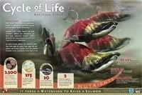
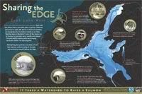
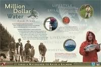
(The kick-ass salmon photography - like on the "Cycle of Life" sign - is courtesy Tom Kline.)
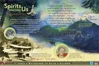
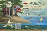
About: Each of these panels is about 36"x24 (91cm x 60cm ish) and were built with a combination of Adobe Photoshop and Illustrator. My boss had the initial concept and then I make it happen. Often I work with the images we are given and different layout ideas come out of that. I pretty much built the majority of the layouts with constant edits from the boss and he does all the copy editing and body typography. If it isn't a photo (or one of the two paintings on the second "Spirits" sign) then I drew it :D. It's difficult to get a true appreciation for how these work as signs unless you print them out full-size - it was quite a learning curve for us to go from working on a comparatively tiny 24" screen to seeing them full-size - there is an entirely different psychology involved in laying out a display piece versus a hand-held piece.
I am particularly proud of the bathymetry (lake depth) map on the 5th sign. I had three shoddy - and non-matching - bathymetries of various parts of the lake and had to piece them together in Photoshop, print it out and hand-label it so I knew which colors were which depths on the mis-matched areas, then re-trace the entire thing in Illustrator. :) I also really enjoyed creating the simplistic yet fun illustrations for the backgrounds. Though I'm eager to some day do something really complex with Illustrator and really flex those muscles, its a personal challenge to "dumb down" my style and I think it worked on these signs.
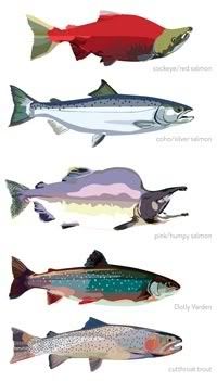
As a bonus, here are the fish from the "Small Fry at Play" sign, bigger. They were one of the last things I illustrated so they ended up much more detailed and less cartoony than the main sign backgrounds that were illustrated - which I think worked because they are foreground subjects anyhow. We just needed fish examples and didn't have photos of them all so illustrating them made it more unified.
