Saturday, December 1, 2007

Nenana Ice Classic Poster


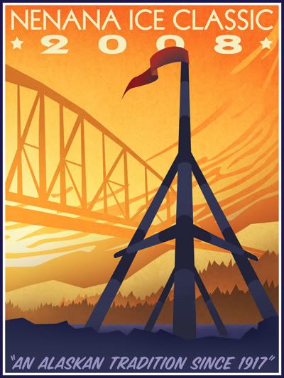
The Nenana Ice Classic that takes place each year in Alaska. This wooden tripod is assembled and put on the ice of the frozen Tanana River in the town of Nenana. The tripod is rigged to a timer and they have a lottery to see who can guess the time at which the ice goes out - at which point the tripod will topple over, stopping the timer.

This was my entry for a poster contest they advertised in the paper. Full-size it is 18"x24". Any age or medium, the only requirements being the dimensions, the text (as seen here), and that the tripod be on it. This took me about 9 hours to do, in Adobe Illustrator and Photoshop.

The whole thing is original with only slight borrowing of the idea of the clouds from an actual 1930's WPA poster for Yosemite. I did nearly everything in Illustrator; the bridge and tripod were both done with simple paths that I then converted to shapes and distorted and hand-manipulated to give them perspective. Once I got everything the way I wanted it, I copied each element one-by-one into Photoshop as shapes so I could manipulate them individually. Each element got its own folder Group in the Layers palette where I then shaded them to my liking and applied a nice texture I made one day at work. The tripod was originally quite cartoony and it took awhile to get it to be simple without looking cheezy. Being a near-silhouette helps achieve a better look, I think. The text is Kabel (top; an authentic 1930's font) and SignPainter (bottom). I left some room at the bottom for the competition folks to add further text, as it looks like they usually have more info on there.

I'm pretty pleased with how it all turned out. It's tough being really simplistic with shapes without making it all look cartoony. I think everything flows well; I originally sketched it with the tripod and the bridge but no clouds - those came later after I researched WPA posters and saw the Yosemite poster that had them. The clouds really give it a lot of energy and helps pull your eyes back up the 'canvas'.

*Note: I attempted to calibrate my monitor before I did this; the color/brightness may be WAY off at the moment. I'm going to take the file to my office and adjust it on my computer there; if the change is severe, I'll update this post.

** This isn't the final version - This hasn't been color corrected and I changed "2008" to be small and to the right under the main heading.

P.S. - I didn't win! ;)

Saturday, August 25, 2007

Dragonfly


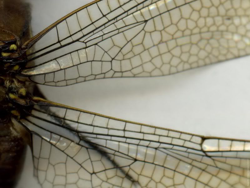
Here are two wallpapers I made of a dragonfly I found on the sidewalk:
Widescreen 1680x1080
Fullscreen 1280x960


I'm working on cleaning up the scan for a left-side of the dragonfly. That way if someone has two monitors side-by-side they get both halves of the dragonfly.

I'd like to do something artistic with this sometime - either in Photoshop or as a painting. The wings are so beautiful - they remind me of the Musée D'Orsay in Paris with its enormous glass and iron canopy - the beauty of humanity's industrial works reflected from nature.

Tuesday, August 21, 2007

WPA-Style Denali Poster

Each summer the MSCVB puts out a series of 4 black and white ads, each covering a different aspect of the Mat-Su Borough (glacier hikes, fishing, canoeing/boating, RVing, etc). This year we changed it up a bit by making the ads look like WPA posters from the 1930's, featuring illustrations by me. :D

We've since carried the WPA flavor over to the 2008 Mat-Su Visitor Guide. The guide breaks the Mat-Su Borough into 5 regions and each region gets its own WPA-style postage stamp. The above image is actually for the "Off the Beaten Path" region, which is everything in the borough that is not road-accessible, but I thought the sky was a good place for text and so dressed it up as a Denali poster just for fun.

The background is closely based on an actual WPA poster for Montana or something - the mountains came pre-resembling Denali so I borrowed their design, though drew it from scratch and did my own color theme. The Cessna 180 is from a photo I took - the colors are totally changed (the original plane was white with brown).

I'll have to upload those ads and the other stamps sometime.

Wednesday, August 8, 2007

Anteater Wallet


I simply adore Engrish.com! My sister and I were wondering to ourselves if it would be possible to create our own Engrish, seeing as how we have a firm grasp of the English language and really, it takes a feeble and carefree grasp of English in order to produce quality Engrish. So we did this MadLibs style: Kaisa randomly picked an animal while I picked a promotional paragraph on some product I had in my room. She picked an anteater and I had picked hand warmers. Next, I had Kais (who didn't know what my product was) give me a noun here or adjective there and took out most of the words in the sentences. And I made a wallpaper out of it.

So no, this is not authentic Engrish! but it is authentic Kara art. The anteater is mine, all mine! The kanji says "wallet" and "giant anteater", à la Wikipedia. Background texture in the wallpaper is mine as well.

Friday, July 20, 2007

Bumble Bee


Sometimes art kind of makes itself.
I found this bumble bee on the floor at work and had the thought of scanning her at the highest resolution possible with our Epson V700. The image is enormous and the detail fabulous. The sheet of paper I put over her kind of makes this nice fuzzy blue backdrop - kind of feels peaceful. I think with the way the bee's head is tucked makes her look sad or shy and tired. Or possibly just dead, but hey. ;) It might be kind of fun to do a quick painting of this sometime.