Showing posts with label digital illustration. Show all posts

Monday, November 12, 2012

Rage Planet

Rage Planet
Photoshop CS4 • 3.5 hrs
November 12, 2012

Done for an ad campaign. Followed a "how to make a planet" tutorial I've used before using my own photos. Had to come up with how to make it all cracked and angry on my own, though. Thought the magnetosphere warped halo was a nice touch. I might clean up some of the cracks a bit later, though.

Friday, October 5, 2012

UPDATE: Rosas in Vector

A long time ago (2006?) I made a LOT of desktop wallpapers themed after the characters of the anime Maria Sama ga Miteru. Many of those wallpapers are probably floating around the internet somewhere - I know most of them survive in my Photobucket. At the beginning of my Marimite art career, I was doing most of my work in Photoshop. One trio of wallpapers I created always stuck in my mind as something I should update by re-creating them in Illustrator. The idea for them was simple and elegant and it was a shame I'd only done them in 3:4 aspect ratio for small screens.

So at one point this summer I had some free time on my hands and so for fun I re-built those wallpapers! Here they are, in one size only (1920 x 1200) done in Adobe Illustrator, September 15, 2012:

Friday, February 4, 2011

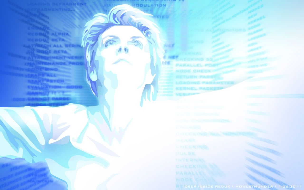
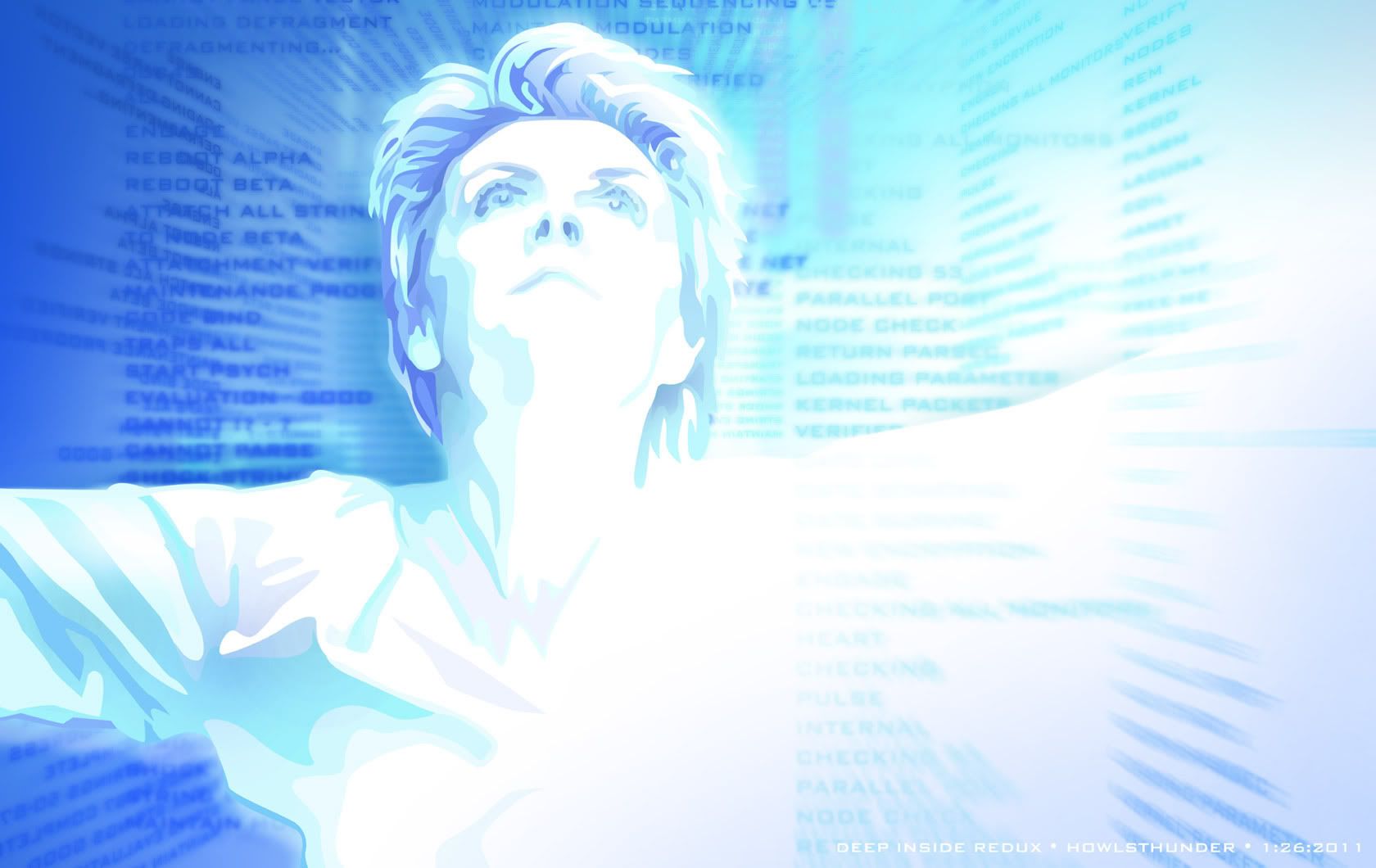
Stargate Resurrected


A lot of digital artists of my generation practice their skillz on making fan art. For me it's the ready-made inspiration so I can concentrate on practicing my software techniques.

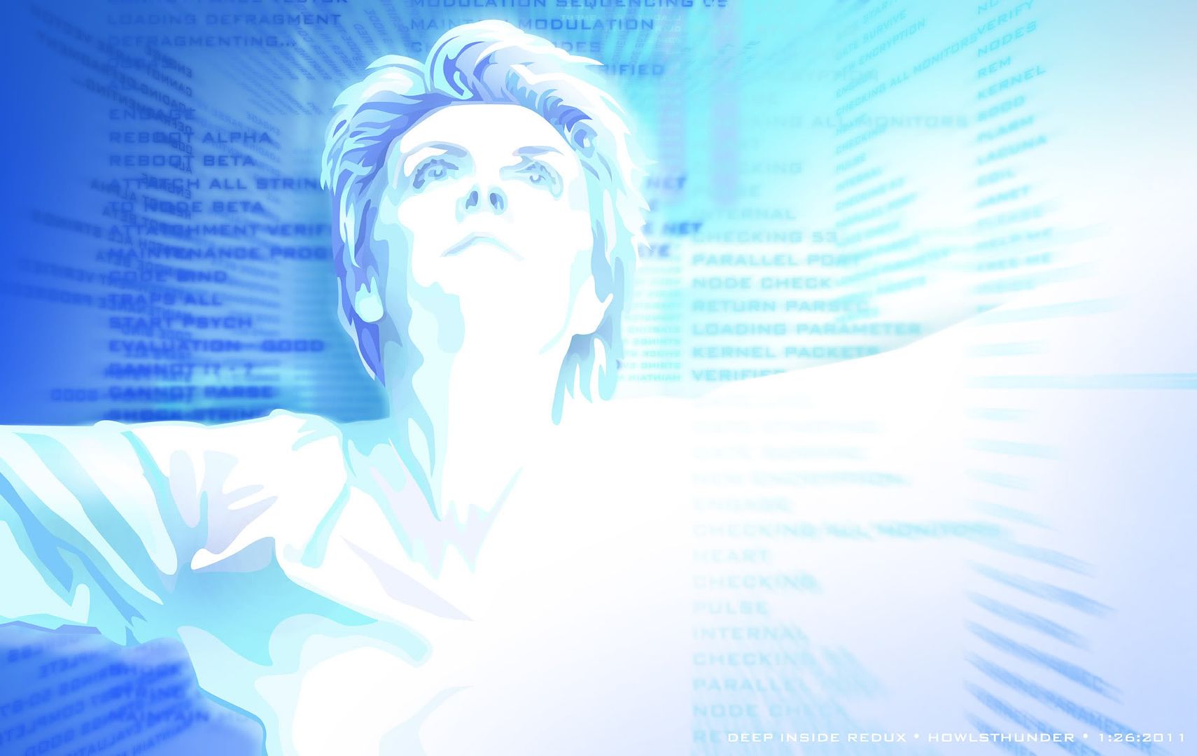
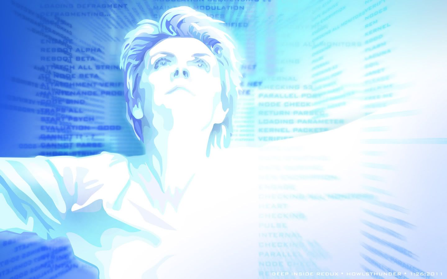
Back when Stargate: SG-1 was on the air (and hadn't jumped the shark) I made a lot of wallpaper fanart, mostly in the grunge style. I wasn't particularly good at it (hey, it was practice) but I came up with some interesting compositions. A few months ago I was going down memory lane, looking at some of them and this one caught my eye. It was a lot cleaner than my older walls and I thought it would make a great vector piece. The old one had a foreground image of Carter laying on the floor and I thought it distracted from the cool background image that I wanted to concentrate on.

To translate for non-Stargate fans, this was from an episode called "Entity" where a digital-based lifeform from another world downloaded itself into Stargate Command's computer system and eventually ended up downloading itself into Carter's brain, taking over her mind and body. The image of Carter is when the entity left her body, creating arcs of electricity that lit everything in blue light. The syntax in the background was seen on all the monitors in the complex.

About 90% of this was built in Illustrator CS4 (Carter, the background color, all the text) and then I brought each element into Photoshop to add some blurring to the text. It was fun putting all the text into perspective. For the most part, the text is as-seen in the screen-shot I took from that episode, though in a few places it was too blurry to make out so I made stuff up.

All Widescreen, no fullscreen, sorry.
1920x1200
1680x1050
1440x900
1280x800

Wednesday, December 1, 2010

Eyak Lake display signs

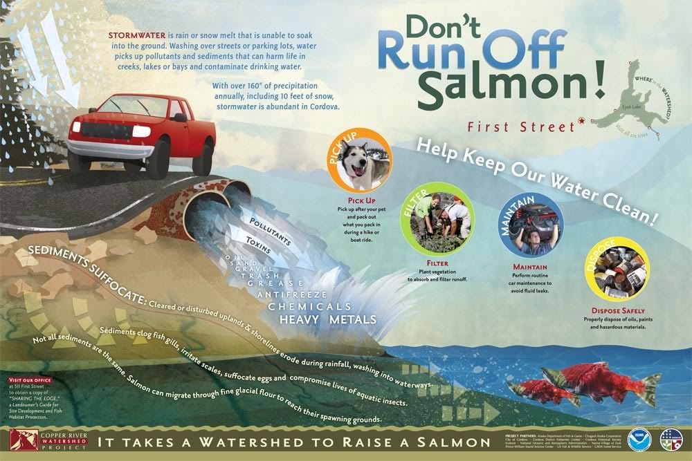
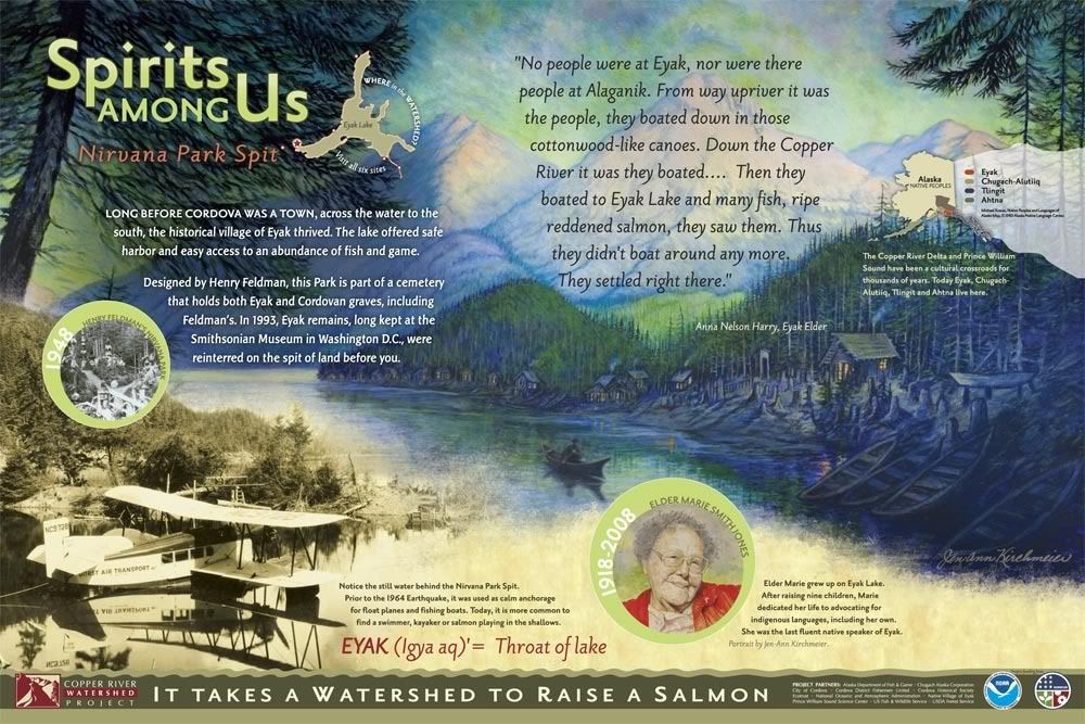
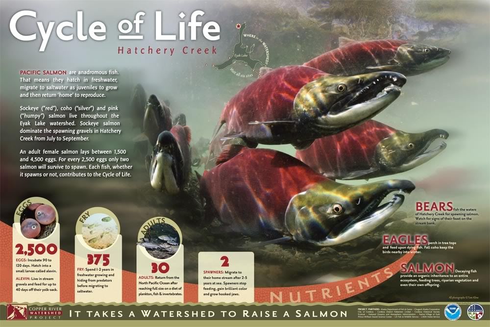
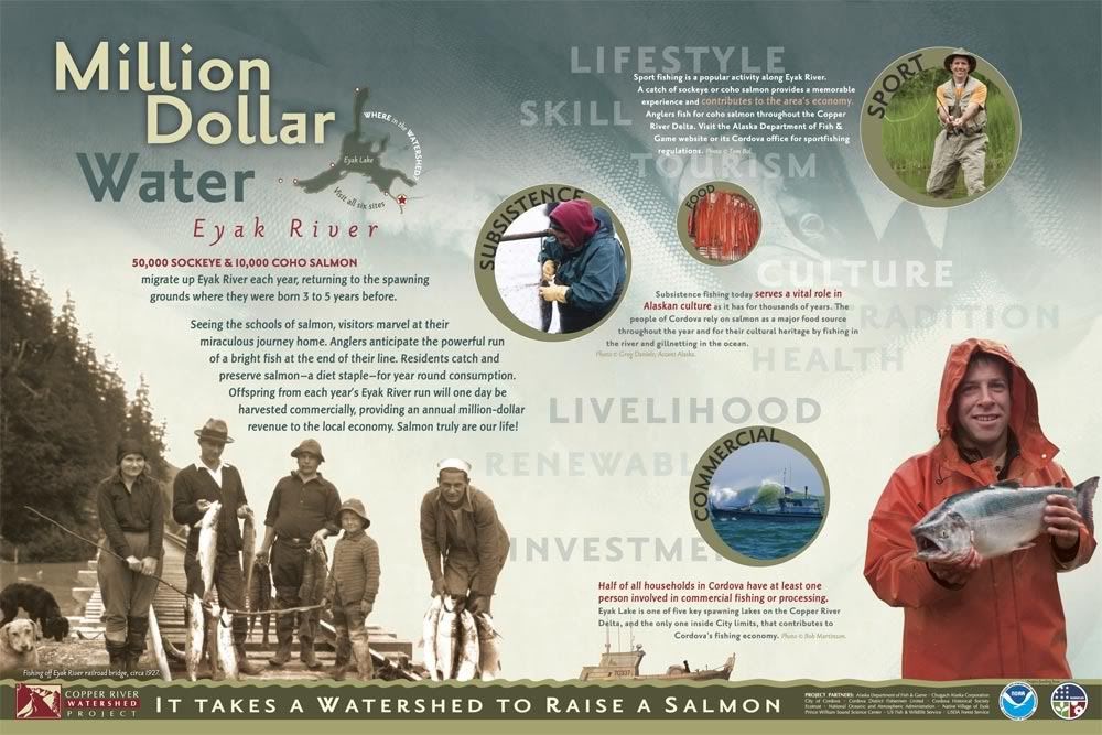
My boss and I recently finished a job designing informational/educational outdoor display panels for the Copper River Watershed Project (CRWP). These six signs will be placed in locations around Eyak Lake in Cordova, Alaska. I hope to see them some day (you can only fly or boat to Cordova).


(The kick-ass salmon photography - like on the "Cycle of Life" sign - is courtesy Tom Kline.)

About: Each of these panels is about 36"x24 (91cm x 60cm ish) and were built with a combination of Adobe Photoshop and Illustrator. My boss had the initial concept and then I make it happen. Often I work with the images we are given and different layout ideas come out of that. I pretty much built the majority of the layouts with constant edits from the boss and he does all the copy editing and body typography. If it isn't a photo (or one of the two paintings on the second "Spirits" sign) then I drew it :D. It's difficult to get a true appreciation for how these work as signs unless you print them out full-size - it was quite a learning curve for us to go from working on a comparatively tiny 24" screen to seeing them full-size - there is an entirely different psychology involved in laying out a display piece versus a hand-held piece.

I am particularly proud of the bathymetry (lake depth) map on the 5th sign. I had three shoddy - and non-matching - bathymetries of various parts of the lake and had to piece them together in Photoshop, print it out and hand-label it so I knew which colors were which depths on the mis-matched areas, then re-trace the entire thing in Illustrator. :) I also really enjoyed creating the simplistic yet fun illustrations for the backgrounds. Though I'm eager to some day do something really complex with Illustrator and really flex those muscles, its a personal challenge to "dumb down" my style and I think it worked on these signs.

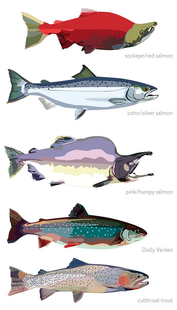
As a bonus, here are the fish from the "Small Fry at Play" sign, bigger. They were one of the last things I illustrated so they ended up much more detailed and less cartoony than the main sign backgrounds that were illustrated - which I think worked because they are foreground subjects anyhow. We just needed fish examples and didn't have photos of them all so illustrating them made it more unified.

Wednesday, September 1, 2010

WPA Moose

This is actually only the size of a large postage stamp - it is a remake using a moose instead of an airplane, with modified colors. I drew the moose and everything else, of course, based on multiple moose. :) Did the vectors and base colors in Illustrator CS4, shading, texture, and text in Photoshop CS4.

Tuesday, October 27, 2009

Color ad Illustrations

As promised, here are some color ad illustrations I've done (see previous post for background details).


These two vertical ads were "ads that never were" - the client switched to a smaller square shape like the winter ads below. I thought I'd share them here for variety.


The sledding piece is a draft for a website banner image. A similar version was done with the canoe for summer; the canoe piece here was the front of a mailer card. We re-use a lot of the illustrations for all kinds of applications.


These three winter images are all in draft stage and are for web. The sleddog team is an example of where an illustration was kept super simple for newsprint and left simple because it is going to be small on the web. The larger images linked here are larger than they will be when finished. Again, we do all our web ads large scale because it will inevitably be used later for print somehow.

Black & White Ad illustrations

I currently work for Whittington-Evans Communications. Its a great place to work because my boss has, over time, increasingly used my illustration skills more and more to replace photography in the ads and other pieces we do for the Mat-Su Convention & Visitor Bureau (MSCVB), one of our more ad-prolific clients. It all started when Chris noted that one of my digital illustration styles feels kind of WPA, a style both he and I like. It tied in with this postal/travel style we were developing for the MSCVB one year and it took off from there and I've had a lot of fun working with this style. Because this style features my illustration work I thought I should share it with you here.


We originally began this style in black and white newspaper ads. Because we were working with newsprint, the designs had to be very simple, much more basic than my usual style. Later I had to adapt all of the illustrations into color. For the most part they converted well but there were a few that required added detail or a change in shading scheme. I did a TON of research, primarily by digging through the Library of Congress' web collection here. It also took some doing to find some WPA-esque fonts in our collection here at work. Our results aren't strictly true to the WPA genre but I think they have enough retro flair to make them eye-catching compared to what you see for ads around the rest of Alaska.

These ads here are just some of my favorites. The RV "Hit the Road" ad was the very first one I did back in 2007. The fishing and glacier ads were also from that year while the "Trail Mix" ad was actually much more recent and was originally color - you can see the evolution in detail as well. In earlier illustrations I tried to keep the people very basic. In actual WPA art a lot of human figures were very stylized since the posters they were going on were done with silkscreen. We also took a different direction with the typography in newer ads, as evidenced on the "Trail Mix" ad.

Working in this style influenced my own art I do for fun and I've since tried simplifying the shapes I draw in Illustrator for a "less is more" look. This is highlighted by this poster I did for a contest.

Monday, February 2, 2009

Still Alive

October 26, 2008
vector art, Adobe Illustrator


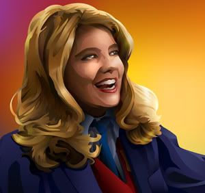
My friend Trey wanted to make her own shirt for the 2009 Xena Convention in LA (which is why this post is 3 months delayed; I couldn't share it until after the con was over). The idea is "Xena's not dead! She's still alive - and she's a cylon!" - and also to celebrate Lucy Lawless herself, who has been making a lot of well-performed guest appearances on various shows since Xena: Warrior Princess ended. "Still Alive" is what sums this up best but is also an homage to the wonderful Jonathan Coulton Portal song of the same name. :)

Trey had originally thought of doing this when my mom still owned her silk screening shop so we came up with an idea for a two-color design (white and red on a black shirt). In October we finally got around to putting the design together. I art directed and had Trey find as many profile-shots and other reference images as he could. In Photoshop, I put together a rough made out of 3 Xenas (head, body, arm/chakram) and 3 cylon images (head, body, cylon). The rest was an Illustrator lesson for Trey where I did the entire image, step-by-step and she followed along, copying me on her own computer and file. Trey's final decision was to use my file, though hers is nearly identical.

Monday, November 24, 2008

Cowgirls


widescreen: 1900x1200 • 1680x1050 • 1440x900 • 1280x800
fullscreen: 1600x1200 • 1280x960 • 1152x864 • 1024x768

About this wallpaper
Roughly 90% Illustrator CS3 and 10% Photoshop CS3.

This is another Facts of Life wallpaper, but I did so poorly on making Blair look like Blair, and because the characters never dress in western wear, it really could be anyone. ;)

I came across some photos of Lisa Whelchel wearing a cowboy hat that made me go, 'ah, ha!' So this is a kind of what-if.

After I got my idea, I lightly sketched out the composition I wanted: Blair sitting on a fence or something and Jo standing behind her. My figure construction skills are seriously atrophied so I had a friend of mine pose for both figures, took photos of her, and used those as reference to get the perspective and everything right.

In Photoshop, I did the main sketch based on the photos I took, then had to do some head hunting for Jo and Blair's faces. Jo's was fine but it was hard finding an image of Blair with her head at the correct angle. The one I ended up using was of her feigning a pouty expression. No matter HOW hard I tried, I could NOT get my drawing to look like Blair without the pouty expression! I think Jo looks fine but... GRR. Now I know why comic artists who have to draw characters from live-action TV or film don't bother. ;)

Anyhoo - I took the sketch (which was nothing finished - literally just a quick 5 minute sketch) into Illustrator and dreweverything there, line work first. I was originally going to have something like forced-perspective telephone wires overhead but went with clouds instead.

I did this over the course of three days. The initial composition set-up took awhile, and tweaking the blonde's face probably took longer than anything else. While it still doesn't quite look like who I was going for, I am pleased with the overall results. :)

Friday, November 21, 2008

Facts of Life Jo wallpaper

Finally! A Jo wallpaper! Based on a screencap from xxsaosinxx (Thanks!)


widescreen: 1920x1200 • 1680x1050 • 1440x900 • 1280x800
fullscreen: 1600x1200 • 1280x960 • 1152x864 • 1024x768

About This Wallpaper
Illustrator CS3, Intuos Wacom tablet, about 4 hours.
I'd had this idea for a Jo wallpaper for awhile, to theme it around her Blair-given "Mr Goodwrench" nickname-insult, in blues with mechanical stuffs happening. After the direction the previous Blair wall went in, I did this one in the same style (which, now that there IS a style, saved a LOT of time!). Stuck with the limited palette and masculine lines. Googled the Goodwrench logo and re-drew it in Illustrator (Live Trace did a lousy job) and found a nice motorcycle engine blueprint to Live Trace to vector and stick in the background. (I was originally going to use some of my Johnstone Supply catalogue illustrations instead since I feel like Live Trace is cheating but I really didn't feel like tracing my own engine. But they were more electrical oriented, not mechanical, so there you go).

I like this one a lot better than the Blair wall - I think it succeeds in its comparative simplicity - but then, as we know, Blair is superficially much more complex than Jo so I think it works. ;)

Sunday, November 16, 2008

Brilliant Blair: Facts of Life wallpaper


widescreen: 1920x1200 • 1680x1050 • 1440x900 • 1280x800
fullscreen: 1600x1200 • 1280x960 • 1152x864 • 1024x768

About this wallpaper
This is the character Blair from the popular 1980s TV sitcom The Facts of Life", which I was very fond of as a kid.
Done in Adobe Illustrator CS3.
I lost count of the hours after the 50th time trying to work on it. Ugh. This is probably the 4th version of this wallpaper and I had started it the day after the last one I posted!

This thing was a pain in the butt. The theme was to be centered around Blair's quintessential "brilliant"; the original idea was to have a gigantic "BRILLIANT" in the background with Blair looking like she feels brilliant, with Jo glaring at her off to the side. ;) I did the whole thing with detailed shading and everything but Jo came out hiddeous. Also, I couldn't get the "BRILLIANT" worked in the way I wanted. I imported everything into Photoshop and tried stuff there to no avail. I ended up ditching everything and started from scratch in Illustrator, drawing it like you see now and then messing around with random shapes and fills, ditching Jo outright.

And yes, that's the VISA credit card logo, from the 80s. Whee. ;)

Here's what it used to look like:

No, I will not be working this into a wall any time soon so do not ask.
I swear I have a Jo one coming up next. Maybe I'll do it in the same style and they'll be a pair. :D

Tuesday, November 4, 2008

StarWars: Dark Leia

I don't generally do requests because I end up being really flaky about getting the piece done. But every once in awhile an idea really strikes my fancy and it not only jumps ahead in the "To Do" queue, it actually gets done!


widescreen: 1920x1200 • 1680x1050 • 1440x900 • 1280x800
fullscreen: 1600x1200 • 1280x960 • 1152x864 • 1024x768 • 800x600

About
It is based on an alternate universe for Star Wars, a "what if" deal: what if Leia led the Empire or something (I think this is based on Star Wars: Infinities - look at me, I don't know what I am drawing!). ;) I had the composition in mind well before I started. This is my first figure construction I have done from scratch in years - ugh, I should of hired my friend Ash or Hemisphere for it! Anyhoo, I made up my own costume based on the comic version and some other artist's version. Sketched in Photoshop CS3, drew everything/colored in Illustrator CS3, brought it all back into Photoshop to do shading and add textures. The stars and clouds are all my own textures. Took about 9 hours or so.

Monday, October 27, 2008

Cylon Centurion

At some point I had the idea to do a cylon centurion wallpaper, and then someone on Facebook requested a BSG wall as well so here I am, finally got to it. :D I would like to do one in a more WPA style which is what I had originally set out to do but got a bit carried away. Ah, well.


widescreen: 1920x1200 • 1680x1050 • 1440x900 • 1280x800
fullscreen: 1600x1200 • 1280x960 • 1152x864 • 1024x768 • 800x600

About…
Ah, pretty basic - I wanted to keep it simple. Drew the cylon and did the gradient background in Illustrator CS3, brought everything into Photoshop CS3 and added textures and the eye glow. One texture is a linen one by me, the other is rust by my friend Deborah Schildt. The eye glow is a brush I made. Took about 5 hours.

Friday, August 8, 2008

Tree for the Trees

4th challenge from the [info]art_wac community. Not too sure how I feel about this one. I am really liking these art challenges because I am not pressuring myself to make a masterpiece each time so I think of these as digital sketches / Illustrator experiments. :)


Widescreen: 1920x1200 • 1680x1050 • 1440x800 • 1280x800
Fullscreen: 1600x1200 • 1280x960 • 1152x864 • 1024x768

Entire thing is vector, done in Illustrator CS3 with my Wacom tablet. Took about 3 and a half hours.

The concept was "trees or forest?". My concept started out with the two being one within the other within the other, etc. but it morphed into this singling out of the tree chart thingey in which I got to experiment with my sedimentary swatches I got from a government cartography website. :D The underground is a world without trees and I half-assedly stole the visual concept from Ben Schlitter, whose stuff I want to try re-creating for practice. The motherboard pattern is from an Apple II blueprint I found online.

Saturday, July 26, 2008

Through the Window


Widescreen: 1900x1200 • 1680x1050 • 1440x800 • 1280x800
Fullscreen: 1600x1200 • 1280x960 • 1152x864 • 1024x768

This is for challenge #3 at [info]art_wac, "View From a Window". Illustrator & Photoshop CS3, took about 5 and a half hours. I wanted it to be completely vector but it wasn't coming out the way I had envisioned it so I brought all the vectors into Photoshop and messed around with it there. I am not very happy with it but it was a good exercise anyway. :)

Sun Foxes


Widescreen: 1900x1200 • 1680x1050 • 1440x800 • 1280x800
Fullscreen: 1600x1200 • 1280x960 • 1152x864 • 1024x768

This is in response to the [info]art_wac LiveJournal art community challenge "fun in the sun" that I missed the deadline for. The foxes were based on a photograph taken by my friend Jan DeNapoli (Muzzy Graphics.net). Everything else is mine, all mine. Illustrator CS3, took about 4 hours.

Friday, July 11, 2008

Self Portrait


Our first assignment over at the [info]art_wac was to do a self-portrait. I was gonna draw mine by hand but ended up not having time. Then earlier this week decided I needed a new banner and look for my LiveJournal. I have a picture of myself in my journal banner because, well, the journal is by and about me, so why not? So I combined the two projects into one.

Technical stuff: Made completely in Illustrator CS1 with a Wacom tablet. I took a photo of myself and traced it by hand in Illustrator. Uhh, that's pretty much it. ;)

Art Stuff: As a portrait, it is me, obviously. Green is one of my favorite colors (blue is the other but my journal was already blue, plus I look better in green ;) ). The wolf is my totem spirit and favorite animal. The trees represent Alaska and my connection to and love for the outdoors. The hill is a recycled graphic I made for an ARIA wall that failed - I love fields for the feel of running free that they represent. The swashes (bitbox.com) are pretty and almost tribal, the way I connect to society. The text is the name of my journal, and the Japanese 石山 から is my name "Ishiyama Kara", "Ishiyama" being my last name translated literally ('Stenberg' meaning 'stone mountain' in Swedish, 'Ishiyama' meaning roughly the same).

Sunday, June 29, 2008

I'd Know You Anywhere


Here's my latest and greatest Maria-Sama ga Miteru wallpaper ;) They are completely vector (except for the blur in the blue sky I had to do in Photoshop), done in Illustrator CS1, based on a promotional image for one of the Marimite OVAs (the 3rd one). The sky was originally for an ARIA wallpaper I was working on but decided was fail and the fun patterns/brushes in the orange one are from Bitbox.com. This took me about 5 hours - 2 for Sachiko & the panda, two for the backgrounds, and another for resizing them all (so much easier in PS but to preserve the colors I have to resize them manually in Illustrator).

(you can so tell I am making these on a Mac due to my designing to the left. Sorry Windows fans...)

Sky version:
Wide: 1920x1200 • 1680x1050 • 1440x800 • 1280x800
Standard: 1600x1200 • 1280x960 • 1152x864 • 1024x768

Vector version:
Wide: 1920x1200 • 1680x1050 • 1440x900 • 1280x800
Standard: 1600x1200 • 1280x960 • 1152x864 • 1024x768