Wednesday, December 1, 2010

Eyak Lake display signs

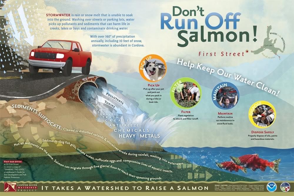
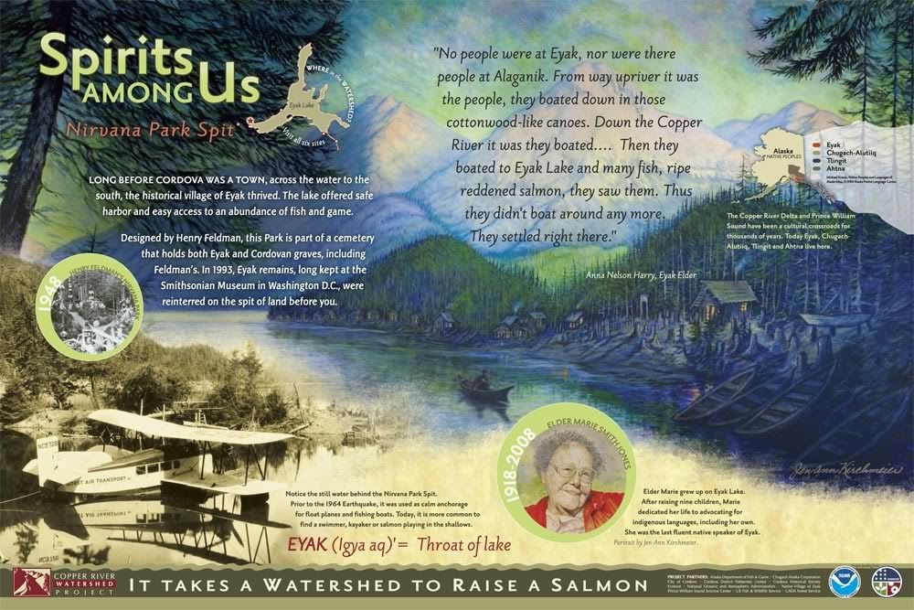
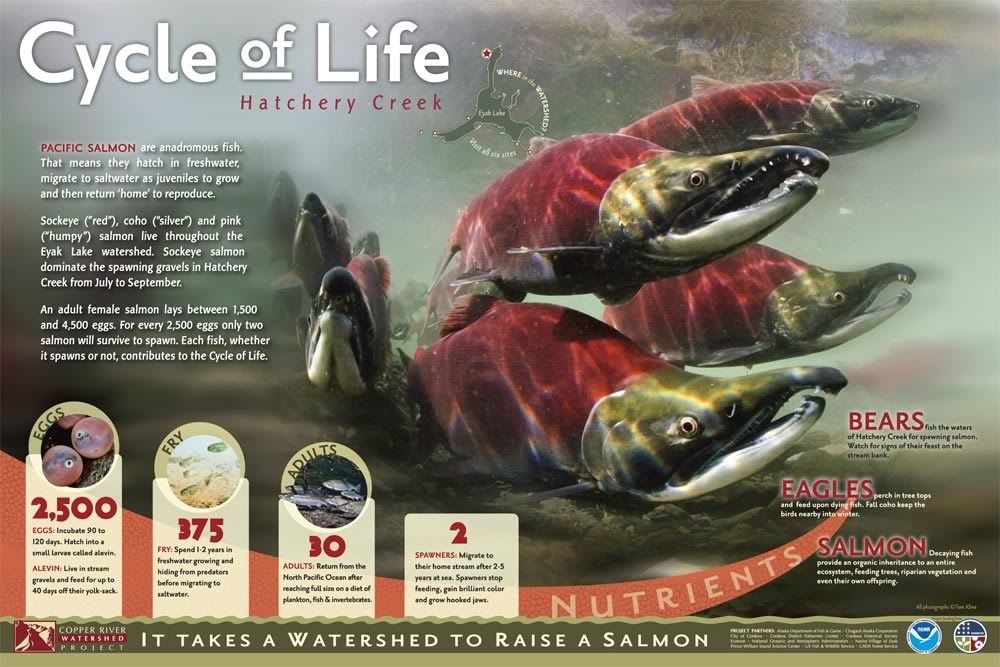
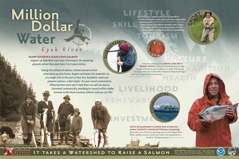
My boss and I recently finished a job designing informational/educational outdoor display panels for the Copper River Watershed Project (CRWP). These six signs will be placed in locations around Eyak Lake in Cordova, Alaska. I hope to see them some day (you can only fly or boat to Cordova).


(The kick-ass salmon photography - like on the "Cycle of Life" sign - is courtesy Tom Kline.)

About: Each of these panels is about 36"x24 (91cm x 60cm ish) and were built with a combination of Adobe Photoshop and Illustrator. My boss had the initial concept and then I make it happen. Often I work with the images we are given and different layout ideas come out of that. I pretty much built the majority of the layouts with constant edits from the boss and he does all the copy editing and body typography. If it isn't a photo (or one of the two paintings on the second "Spirits" sign) then I drew it :D. It's difficult to get a true appreciation for how these work as signs unless you print them out full-size - it was quite a learning curve for us to go from working on a comparatively tiny 24" screen to seeing them full-size - there is an entirely different psychology involved in laying out a display piece versus a hand-held piece.

I am particularly proud of the bathymetry (lake depth) map on the 5th sign. I had three shoddy - and non-matching - bathymetries of various parts of the lake and had to piece them together in Photoshop, print it out and hand-label it so I knew which colors were which depths on the mis-matched areas, then re-trace the entire thing in Illustrator. :) I also really enjoyed creating the simplistic yet fun illustrations for the backgrounds. Though I'm eager to some day do something really complex with Illustrator and really flex those muscles, its a personal challenge to "dumb down" my style and I think it worked on these signs.

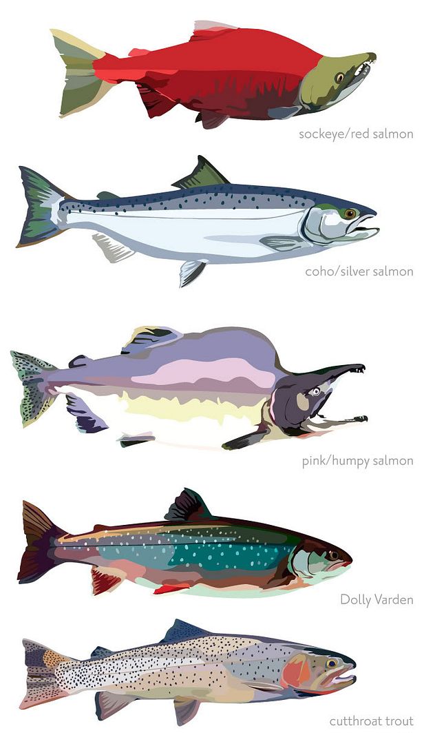
As a bonus, here are the fish from the "Small Fry at Play" sign, bigger. They were one of the last things I illustrated so they ended up much more detailed and less cartoony than the main sign backgrounds that were illustrated - which I think worked because they are foreground subjects anyhow. We just needed fish examples and didn't have photos of them all so illustrating them made it more unified.
Wednesday, September 1, 2010

WPA Moose

This is actually only the size of a large postage stamp - it is a remake using a moose instead of an airplane, with modified colors. I drew the moose and everything else, of course, based on multiple moose. :) Did the vectors and base colors in Illustrator CS4, shading, texture, and text in Photoshop CS4.

Sunday, January 31, 2010

Limelight

20"x26" oil on illustration board, 10 hours

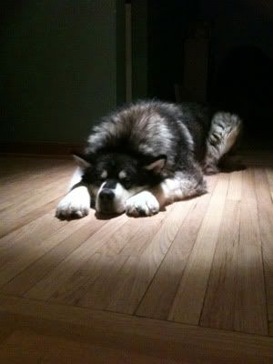
Last week at the office, Gary's dog Gus was taking a nap in the hall. My boss, Chris, took the opportunity and turned on the hall spotlights and snapped this photo on his iPhone. I knew right after seeing Gus that this was a painting just waiting to be made so it was lucky Chris got the shot.

Gus is an ENORMOUS malamute - his head is bigger than a backpack and one of his feet are bigger than both of mine put together! But he's pretty low-key and I think this kind of captures a good chunk of his essence.

I am starting to like illustration board again, this being my second piece on it since I originally learned to paint on it 18 years ago. I really like the smooth blend I achieved on the wall and the black stayed more matte than if it had been on canvas, I think. I had a deuce of a time with Gus's fur; I started getting too detailed which clashed with the overall style so I blended it all together and tried again but with large strokes to give a general sense of color. And no, his rear foot isn't missing, he's laying on it.

Sorry no in-progress photos to speak of; I forgot my camera all three days I worked on this.

Friday, December 25, 2009

Cessna 180 N2294C

Oil on illustration board, 40" x 20", 3 days

I did this for my dad for his Christmas present. I really don't know how long it took to do but it happened over the course of 5 days, but I didn't work entire days. Anyhow, I painted it from a photo of my dad and his airplane, a Cessna 180. I think the photo was taken at the Kustatan River on the western side of Cook Inlet here in Alaska. My dad no longer has the airplane but it was a big part of all our lives. My dad got his pilot's license only a month after he got his drivers license and went to college to be a professional pilot, though that is not what he ended up doing. He got this airplane before I was born and my sister and I pretty much grew up in that airplane. We would at least fly once a month if not once a week until I went to college. I miss flying and I miss that plane terribly. I think my dad is content with his boat now but hopefully he'll like this painting. :)

Below are some in-progress photos. All of these are a bit warped because the illustration board is a bit curled. Ah well. There are 4 pictures, one for each day, basically, not counting the final piece (click on the above thumbnail to see the final piece larger).


Penciled in. That took several hours. O_O;


Blocked in. Normally I'd stain the entire canvas but time was not on my side - see, one nasty thing about illustration board is that it sucks up the paint so it takes a LOT more paint (and more time) to block in the piece.


Plane underside shaded and clouds done.


Airplane and other items colored in and grass added (I hate it).
After this step the only things that were added were the plane numbers, the corrugation on the tail flap, highlights on the white bits of plane, Pop's fishing pole, and my signature - things that couldn't be done with so much wet stuff going on previously.

~==~

Overall it looks pretty sharp I think. Its an awesome photo of the plane anyway and I am pretty pleased with the saturated colors and the clean lines I managed with the plane (as in, how crisply I painted the whole plane, not just the stripes on it, though I gotta say those were a pain. Steady-handed surgeons watch out!) I hate painting grass and rather like it all impressionistic and I think maybe the whole piece could be more successful if everything but the plane and Pop were blurry but your eye doesn't really ever settle in the grass so I don't think it matters. It's a gift, not a gallery piece and a good chance to try things out and learn.

Damien

Oil on canvas, 12" x 16"
I didn't keep proper track of time on this one since I split the time across two days but it took longer than Shadow. I'd guess maybe 10 hours. (the dark shadow across the top is from my easel, sorry).

My second Christmas present painting is done! This one is of my Aunt PeterAnn's old dog Damien who was very dear to her. Damien died when I was 2 or 3 but I have faint memories of her. Because I was so young, I couldn't say her name properly so it always came out "Dame-er". I referred to her as Damer for years and always thought it strange when my Aunt referred to her by her actual name and to this day I default to "Damer". ;)

The photo this was painted from was poorly composed as far as light goes; Damien's eyes weren't lit at all, for one, so I had to play a few things up a bit. What's kinda funny is that the photo this is from lives on the same page as the reference photo for Shadow. Its kind of fun that I happened to paint two photos from the same page of the same album of two dogs in the same house when we all lived at my grandparents. :)

It was harder to find a line between detail and generalizations with my brush strokes, which is why this one took longer, since Damien HAD more detail to paint. I think the halo effect semi-sorta kinda worked. It was harder to know where the blues in her fur lived and I think I could of gotten her chest shaded a bit darker but it works. I painted it under harsh kitchen lighting so it looks fantastic under more dim, usual lighting. Though I think Shadow is way more successful as an art piece, I think my aunt will like Damer just fine. ^_^

And I happened to take a photo of this painting after I got it blocked in so you can see what it looked like at the midpoint:


One final note of trivia; both the Damer and Shadow paintings are recycled! They use canvases that were part of this stupid 7-canvas painting I started in highschool but never finished. Another fun thing that binds the two art pieces (the others are: same paint, same dimensions, same photo album, same location, same time period). :D