I thought I would throw out a few pointers for those wanting to try their own bleach stencils.
Design
Choose something simple for your first stencil, something that cuts out in one piece so that you are only placing one piece of acetate down and not having to align little bits that get cut out separately. For instance, in my previous post, the heart on the Companion Cube had to be glued down separately. Also, little details are more difficult to keep from bleeding, so the more simple the design, the more likely your stencil will come out.
Materials
• a well ventilated area
• wear old clothes you don't mind ruining should you get bleach on them
• rubber gloves if you don't want bleach on your hands
• towels to cover your workspace and to protect areas of your shirt not blocked by the stencil
• chlorine bleach
• spray bottle - as fine of a mist as you can find
• X-acto knife (a utility knife or box cutter won't do it for details)
• spray adhesive
• lots of paper towels
• a hairdryer
• stencil material - I use acetate transparencies. You can get printable overhead projector sheets at Wal-Mart. I have also used Dura-Lar acetate, which is super heavy duty. Makes a more durable stencil but is a PAIN to cut out.
Process
1) Cut out your design. Careful not to over-cut corners because the stencil may tear at these points when removing it from your material
2) Lay out your item to be stenciled as flat as possible. It may be a good idea to insert a stiff, flat object to keep the item stretched flat (I used cutting boards) and to prevent the item from bleeding through to the other side in the case of shirts and the like.
3) Spray the back-side of your stencil with a light coat of adhesive and place your design. A little goes a REALLY long way so don't overdo it or you will have a hell of a time trying to remove your stencil from your shirt. Make sure to get any detailed areas as those are the most prone to bleeding.
4) block off any areas of your material that you don't want to get bleach on. If your design goes pretty close to the edge of your stencil, you may want to extend the border of your stencil with wide tape to prevent overspray.
5) Bleach away! Go one 'layer' at a time, don't saturate your material. Pat off excess bleach with towels/paper towels, especially on detailed areas, to prevent bleeding. The bleach will take a minute to fully "develop" so be patient - it is slower on materials such as denim or Carhartt so give it a little time. Blow dry your design between 'layers' so that the material doesn't become over saturated and bleed under the edges of your stencil. The more bleach you lay down, the lighter the design.
7) When you've got your design the way you want it, dry your design as best you can, then carefully remove your stencil. Tumble dry your material to beat out the crystalized bleach. Failing to do so and then washing your item can cause the bleach to re-activate and ruin your design.
* * * * * * * * * *
Those are the basics! Keep in mind that bleaching fabric also makes it weaker and prone to wearing out faster than the rest of your material. This method of decorating clothes is not good for items you want to last a long time, its more for raggy stuff you have lying around.
http://www.stencilrevolution.com/forum/viewtopic.php?p=354443
This is the link to the original article I read that got me to give this all a try. In the comments you will find a whole slew of ideas that other people came up with to help you get inspired. If you try it out, too, comment with a link to your design so I can see what you made. :D
Wednesday, March 12, 2008
Bleached Shirt Designs
 Last fall I saw an article on BoingBoing.net featuring a how-to for bleach stencil art on clothes. I immediately knew this was something I had to try. In October my friend Trey and I tried it out with a tribal wolf and horse I had designed. We had varying degrees of success testing some of the rules:
1) use 100% cotton ONLY. Poly blends will not work
2) use spray adhesive to keep your stencil flat on the shirt
3) do not oversaturate your material (causes bleeding)
Half the fun is watching the bleach "develop" the shirt, especially out of a black shirt since black ink often has some other color as a base, usually a rust or pinkish tan. We experimented with khaki, which can give anything from a greenish yellow to orange.
This past week, my friend Eric and I decided to make some shirts to honor our new favorite geekdom, Portal, in particular, the Weighted Companion Cube from the game (see above). This led to a few more fun designs, including the MYST spaceship (a 2-stencil design by Eric) and the Maria-Sama ga Miteru text logo and some character silhouettes.
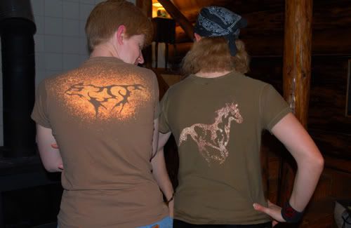 Here's Trey and I modeling our wolf and horse designs. Each stencil (usually with more simple designs) can be used in both the positive and the negative. These were done with a globby, generic spray bottle and no adhesive on the stencils.
 Here's the Companion Cube in all its glory on a black shirt. Its fun to bleach some areas a bit more than others in order to achieve a grungy, airbrushed look.
 Here's Eric in his $8 Carhartt coat with MYST rocket ship. He did this stencil in two pieces, one for the body and one for the fins and nose. Carhartt takes more time to bleach than a thin shirt but the end result is worth the patience for sure. I gotta come up with something to put on my own Carhartt...
 The Marimite logo. It says "Maria-Sama ga Miteru" which loosely means "Maria is watching Us" or "[the Virgin Mary] Watches Over Us". This was done on a slate blue longsleeve shirt.
 My second Marimite shirt with the addition of a stencil of two characters running hand-in-hand along the bottom hem. The characters (Sei and Shimako) were made with the vector from the blue wallpaper in my previous post. I used two sheets of acetate taped together to get the width I needed to get the design to wrap around the side of the shirt so that one character was on the front while the other was on the back. What is amusing about this shirt is that while the fabric is navy blue, it bleached out a magenta color. I was kind of bummed at first but I think it makes a rather striking shirt. :)
Saturday, March 8, 2008
Marimite Wallpapers
Maria-Sama ga Miteru ("Marimite" for short) is a shoujo anime that was recently licensed in America (finally). It follows a group of girls on the student council at a Catholic girls school and is basically about their friendships and their character development. There's no action, no traumatic events - just minor high school drama with a lot of heart, no big plots, and tons of character development. ;) As a fan, I take the opportunity to practice my Adobe Illustrator skills by making wallpapers. Here are the three latest, all Marimite themed:
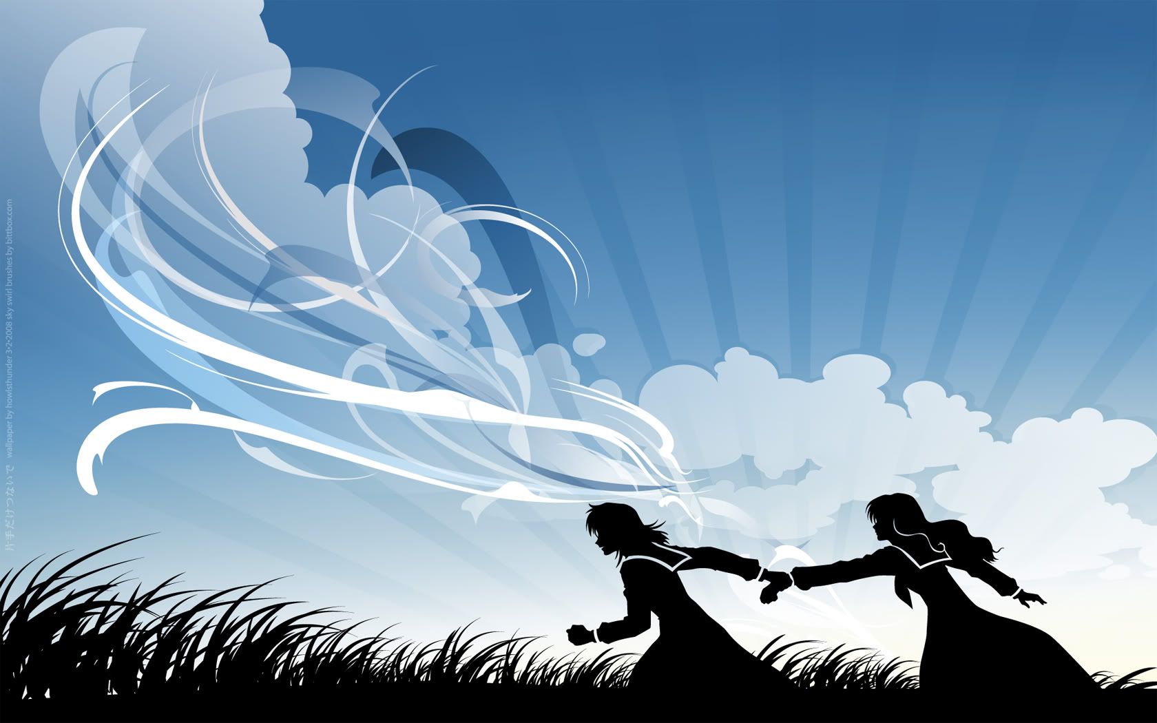
 I had the image of this wall in my head when I woke up one morning - a wind-swept hill with clouds and people running along. Done in Illustrator CS1 with a bit of masking done on the rays in Photoshop CS1, the only thing I didn't create myself are the decorative swooshes in the sky, which were by Bittbox.com. I did the clouds twice, the first time with too much detail that left me unsatisfied, which is when I decided to try swooshes. I am particularly proud of the grass on this one.
Widescreen: 1920x1200 • 1680x1050
Fullscreen: 1600x1200 • 1280x960 • 1024x768
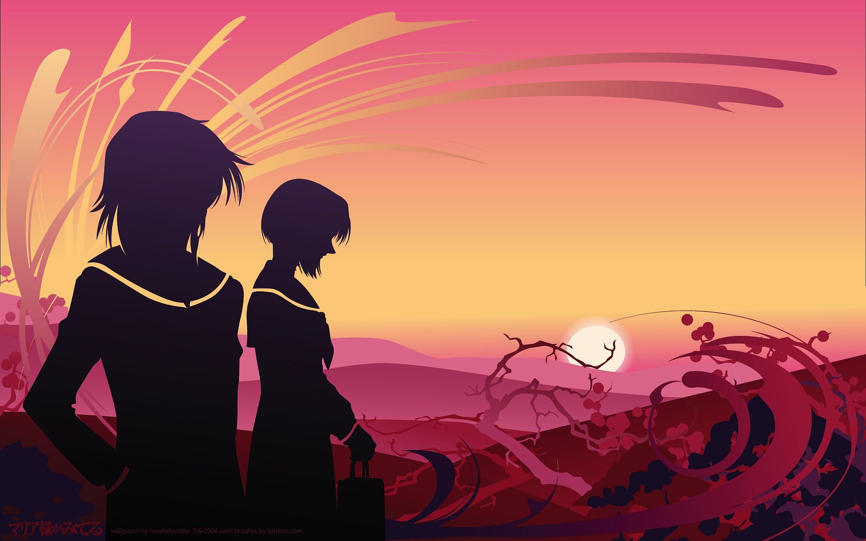
 Done completely in Illustrator CS3, 5 hours. This second wall I am the most happy with as it has the best sense of mood and most interesting composition. I generally start out a wallpaper with a color in mind and this was originally to be sunset orange with a silhouetted tree-covered hill. Immediately the sunset went pink & yellow and I didn't ever get to the silhouetted hill once I found a good reference picture that had hills instead. I had major color space issues on this wallpaper so what you see is not quite what I had originally created - yet one more reason I am a print person, not a web person. ;) Long story short, working on a Mac, and not in the right RGB space (sRGB IEC61966-2.1).
Widescreen: 1920x1200 • 1680x1050 • 1280x800
Fullscreen: 1600x1200 • 1280x960 • 1152x864 • 1024x768
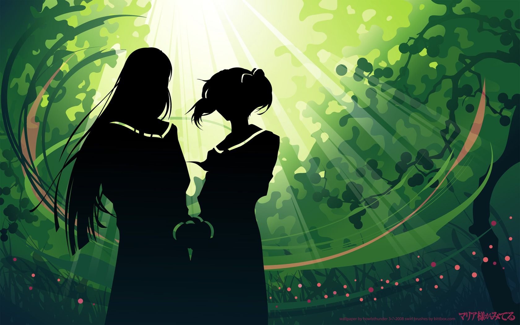
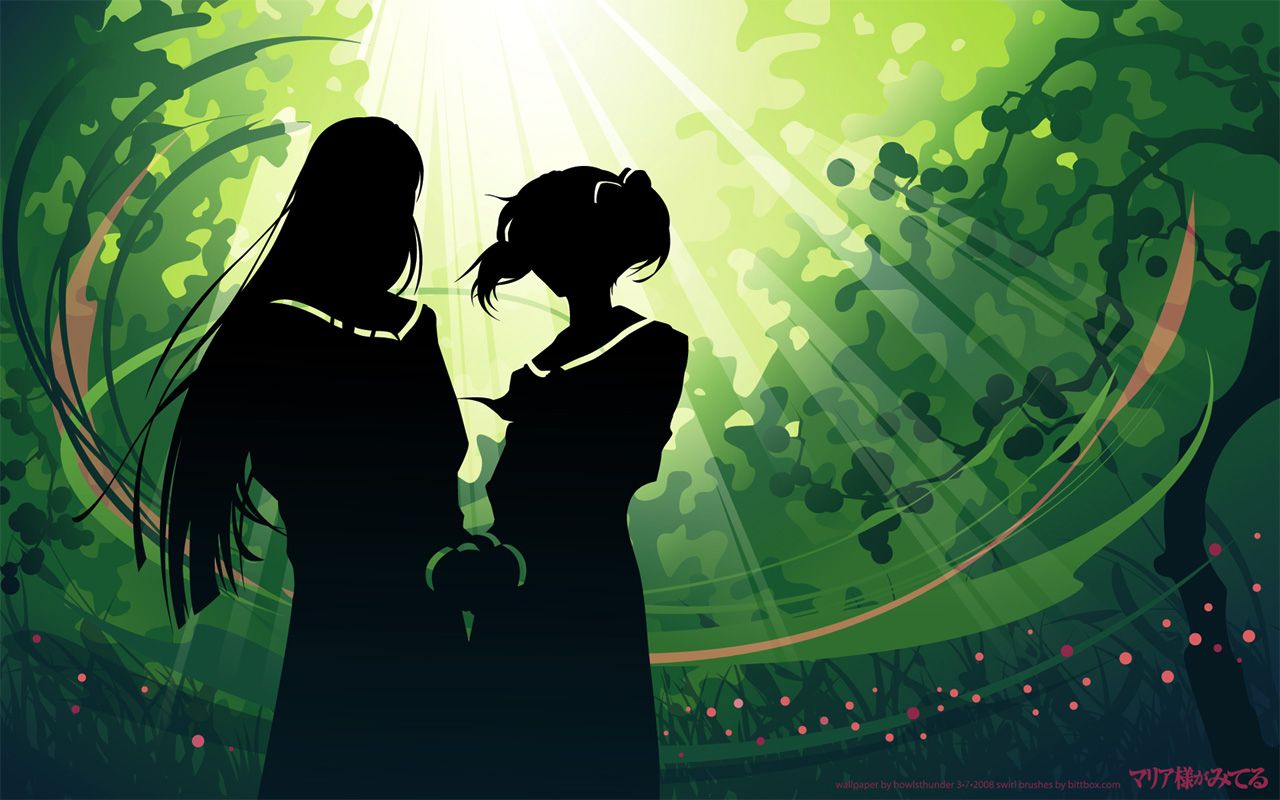
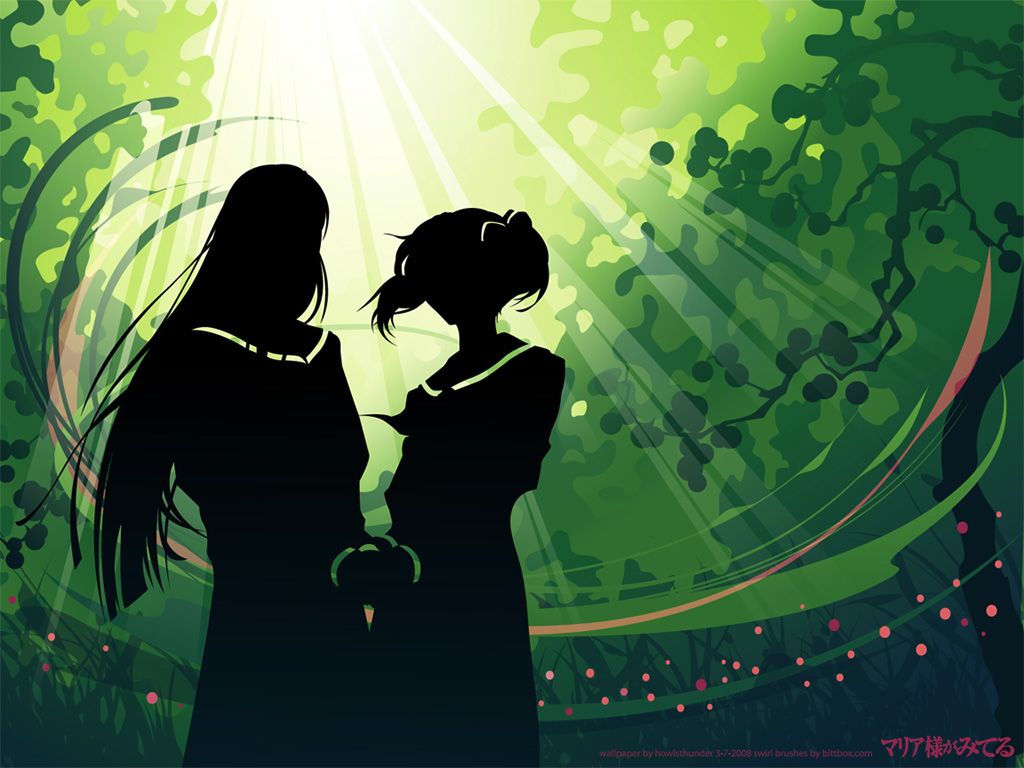
 Done completely in Illustrator CS3, 7 hours. Again, I started out with a color (green), which to me means plants. While all the walls were experimental, the first two were a bit more "safe" in that they are set in a wide-open landscape where this one is cloistered in the woods. It is much easier to place things compositionally against a wide open sky than it is to build a particular setting so this piece was a bit tricky and I feel loses its sense of mood. At any rate, it was a great chance to try getting the opening in the leaf canopy created and to try out creating rays of light. At first the grass was dark and in the foreground but when I took it away everything looked better. In the end I put it back in and pushed it back because, as a friend pointed out, it reminds us of the layered nature of a forest setting.
Widescreen: 1920x1200 • 1680x1050 • 1280x800
Fullscreen: 1600x1200 • 1280x960 • 1152x864 • 1024x768
I think I will do more, perhaps in other fandoms as well. The fun thing about keeping them entirely vector is that they are infinitely re-sizeable for print, unlike most of my previous walls which were built at 72ppi. I also really enjoy the practice in Illustrator- it has always been my favorite program but it is more technically challenging to learn. I never learned how to use gradient meshes in college or any of the other fancy stuff Illustrator can do so I am trying to push the limits on what I DO know how to do and I am discovering little bits as I go along. :)
I had the image of this wall in my head when I woke up one morning - a wind-swept hill with clouds and people running along. Done in Illustrator CS1 with a bit of masking done on the rays in Photoshop CS1, the only thing I didn't create myself are the decorative swooshes in the sky, which were by Bittbox.com. I did the clouds twice, the first time with too much detail that left me unsatisfied, which is when I decided to try swooshes. I am particularly proud of the grass on this one.
Widescreen: 1920x1200 • 1680x1050
Fullscreen: 1600x1200 • 1280x960 • 1024x768
 Done completely in Illustrator CS3, 5 hours. This second wall I am the most happy with as it has the best sense of mood and most interesting composition. I generally start out a wallpaper with a color in mind and this was originally to be sunset orange with a silhouetted tree-covered hill. Immediately the sunset went pink & yellow and I didn't ever get to the silhouetted hill once I found a good reference picture that had hills instead. I had major color space issues on this wallpaper so what you see is not quite what I had originally created - yet one more reason I am a print person, not a web person. ;) Long story short, working on a Mac, and not in the right RGB space (sRGB IEC61966-2.1).
Widescreen: 1920x1200 • 1680x1050 • 1280x800
Fullscreen: 1600x1200 • 1280x960 • 1152x864 • 1024x768
 Done completely in Illustrator CS3, 7 hours. Again, I started out with a color (green), which to me means plants. While all the walls were experimental, the first two were a bit more "safe" in that they are set in a wide-open landscape where this one is cloistered in the woods. It is much easier to place things compositionally against a wide open sky than it is to build a particular setting so this piece was a bit tricky and I feel loses its sense of mood. At any rate, it was a great chance to try getting the opening in the leaf canopy created and to try out creating rays of light. At first the grass was dark and in the foreground but when I took it away everything looked better. In the end I put it back in and pushed it back because, as a friend pointed out, it reminds us of the layered nature of a forest setting.
Widescreen: 1920x1200 • 1680x1050 • 1280x800
Fullscreen: 1600x1200 • 1280x960 • 1152x864 • 1024x768
I think I will do more, perhaps in other fandoms as well. The fun thing about keeping them entirely vector is that they are infinitely re-sizeable for print, unlike most of my previous walls which were built at 72ppi. I also really enjoy the practice in Illustrator- it has always been my favorite program but it is more technically challenging to learn. I never learned how to use gradient meshes in college or any of the other fancy stuff Illustrator can do so I am trying to push the limits on what I DO know how to do and I am discovering little bits as I go along. :)
Subscribe to:
Posts (Atom)